Best White Paint Colors of 2025 | The Ultimate Guide
Trying to decide between Benjamin Moore Swiss Coffee vs White Dove, or Sherwin Williams Alabaster? This white paint guide has all the best colors!
Choosing the perfect white paint color can be tough! Who knew there could be so many different shades of white?
Are you stuck trying to pick between Benjamin Moore Swiss Coffee and White Dove? Can’t decide between Sherwin Williams Alabaster and Benjamin Moore Simply White? Don’t worry – I got you!
This site uses ads and affiliate content as an Amazon associate earning on qualifying purchases. Disclosure.
This white paint guide will help you find the perfect color for your home.
Get the printer-friendly version!
I have everything you need in this post to choose a white paint color. But it’s a long read… Which is why I offer a printer-friendly eBook version for only $5 so you can save, print, and refer to it anytime, ad-free! (images included)
Plus, I made a quick reference list of all the paint colors from this post together on one page (page 43) so you can easily take to the store with you. Grab your copy by clicking the button below.
Best White Paint Colors

This article breaks down the most popular white paint colors in detail with photos of each color in real homes. I break down the undertones in each color, as well as give a few ideas on where to use the color in your home.
At the end of the post, I also share some painting hacks, my go-to painting supplies, as well as how to get a great deal on paint. So be sure to scroll to the end!
Best White Paint Colors Video
I also created a video version of the post (with even more photos!) over on our Joyfully Growing YouTube channel.
If you prefer video content, check out the video below. Otherwise, keep reading to see all my favorite white paint colors.
Top White Paint Colors For Interiors & Exteriors
Ready to dive in? Here are my top picks for white paint colors!
These are the most popular white paint colors, used by both interior designers and homeowners alike. Let’s break down each color and talk about what makes each shade of white paint unique.
To pick the perfect white paint for your project, here’s what you need to know!
Swiss Coffee (OC-45) by Benjamin Moore
Swiss Coffee – LRV: 81.91 (LRV, or Light Reflectance Value is a scale commonly used by design professionals where 0 = absolute black and 100 is pure white.)
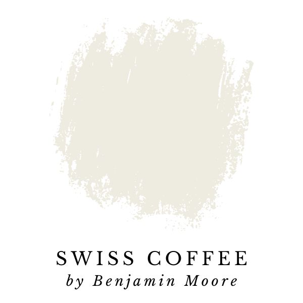
Benjamin Moore is my absolute favorite paint and Swiss Coffee (OC-45) is just one of the many reasons why. I mean, can you really go wrong with a name like Swiss Coffee? Fun fact: my mother-in-law actually puts a lot of significance in paint color names, and I think she might be on to something!
Swiss Coffee has a LRV of 81.91 which puts it right in the sweet spot for bright white paint colors. It’s bright enough to make a room feel light and airy, but not so bright that walls start to look boring and sterile. Swiss Coffee has mildly warm undertones which tends to create an inviting and happy feel.
Here’s how Benjamin Moore describes Swiss Coffee:
“An essential white with just the right amount of warmth.”
Benjamin Moore
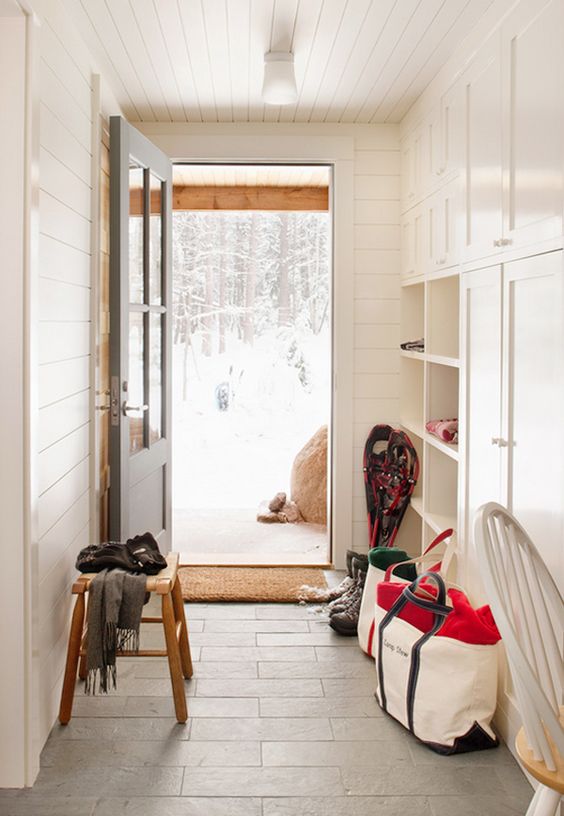
The warm inviting entry room below is painted with Benjamin Moore Swiss Coffee.
White Dove (OC-17) by Benjamin Moore
White Dove – LRV: 83.16 (LRV, or Light Reflectance Value is a scale commonly used by design professionals where 0 = absolute black and 100 is pure white.)
Also known as Benjamin Moore: PM-19
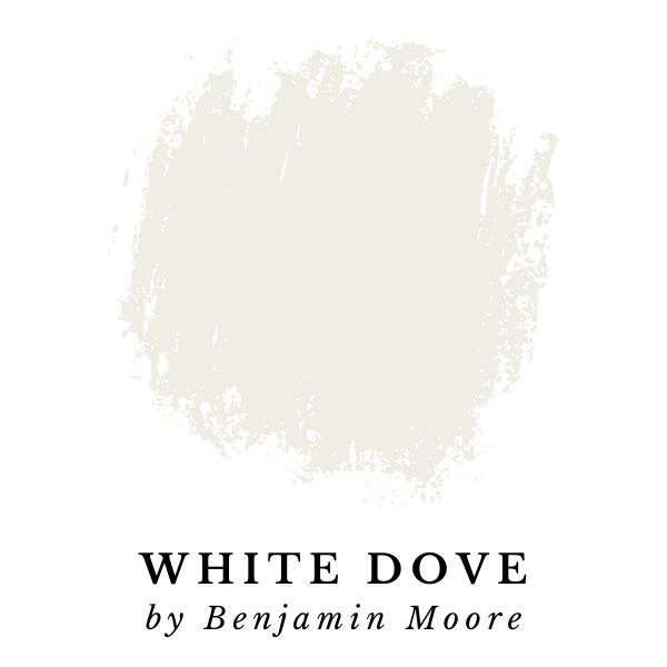
Benjamin Moore White Dove is my go-to white paint color! I love its slightly warm hints of grey. The white creaminess of this paint color has a calming vibe that makes any home feel more inviting. It’s perfect for interior walls, trim, doors, or even a white shiplap accent wall if you’re feeling brave.
I like it so much that I used White Dove to paint my entire home! Check out my full White Dove Paint Color Review – I share my personal experience with the color, tons of pictures, and all the nitty gritty details.
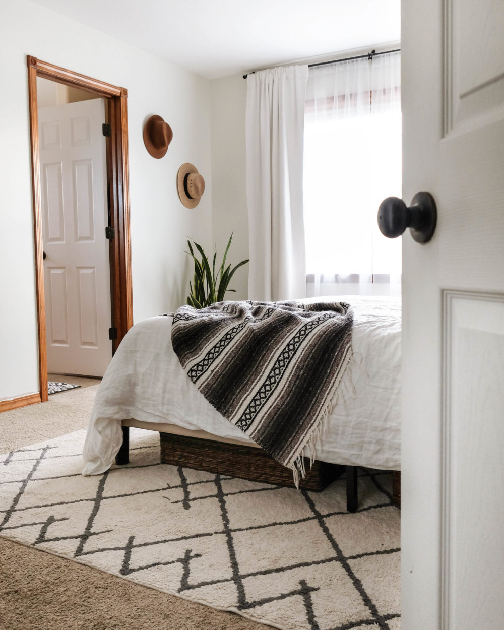
White Dove has sophisticated color nuances and looks great in all lighting conditions. I’ve found that many warm white colors can be less appealing (or worse) when paired with warm lighting. This is not the case with White Dove. The color isn’t warm enough for that to be a problem.
Benjamin Moore describes White Dove as:
“Unerring style defines this clean and classic white.”
Benjamin Moore
It looks good on moldings and trim, but White Dove is a versatile color that also looks great anywhere! All of the white walls and trim you see in my home are painted with White Dove. It’s my #1 choice for many reasons, but the most important reason is it looks amazing no matter where you put it!
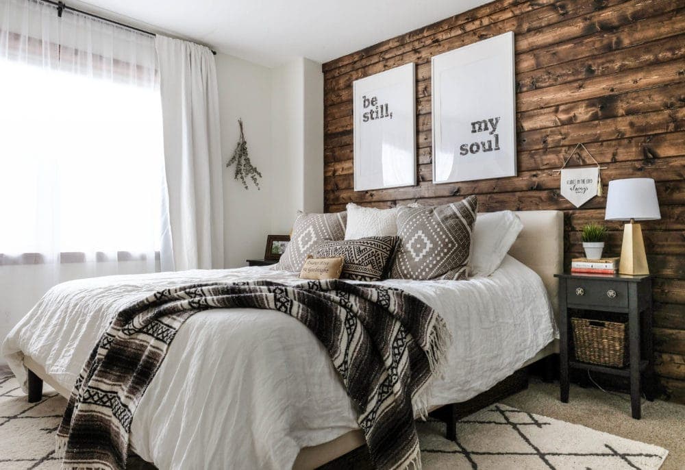
In the image below, Benjamin Moore White Dove paint pops against the natural tones of the wood accent wall in our master bedroom.
FAQ: Swiss Coffee or White Dove?
Benjamin Moore Swiss Coffee vs White Dove


Swiss Coffee and White Dove are very similar colors with subtle differences. They are both members of Benjamin Moore’s off-white collection.
Swiss Coffee is creamier and slightly warmer with stronger yellow and grey undertones. White Dove is slightly brighter with a LRV of 83.16 compared to Swiss Coffee’s LRV of 81.91.
If you’re looking for an interesting white paint color that is a little more off-white than white, then Benjamin Moore Swiss Coffee might be the perfect choice for you. Both colors work well in most rooms, however in a room with limited natural light, White Dove would be the better choice.
Guess What? There’s a WAY better way to test paint colors on your walls!
Before we get too much further into my list of best white paint colors, I need to fill you in on a little-known painting hack.
The hack? Peel and stick paint samples.
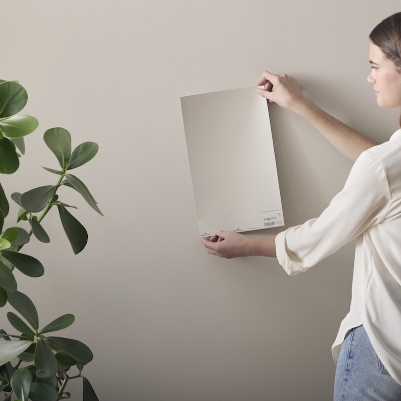
White is one of those paint colors where there’s so many options with subtle differences, you really need to see the colors in person.
This is why I always recommend testing outpaint colors in your home. Once a sample is up on your wall, sometimes you’ll realize instantly that it’s a YES! or a definite NO!
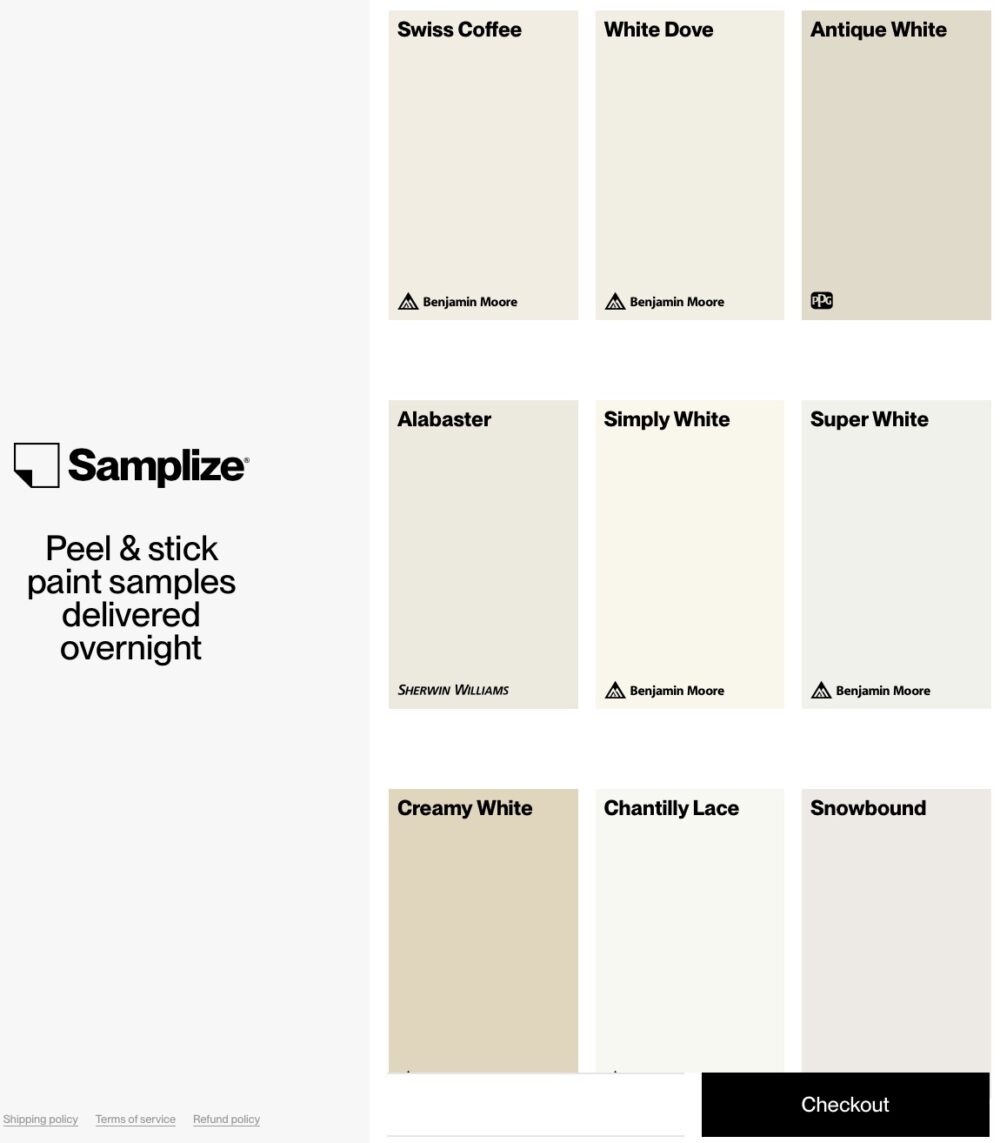
For the easiest, no mess way to test out paint colors, check out these Peel-and-Stick Paint Samples from Samplize. Gone are the days of purchasing all of those small paint samples and painting big squares of different colors on your walls!
After learning about Samplize, I use their peel-and-stick samples for every painting project.
Sale alert! Right now you can get 2 samples for FREE, when you purchase 8 or more.
Here’s to choosing paint colors with confidence!
Ok, back to the list of top white paint colors…
Antique White (PPG1024-2) by PPG Paints
Antique White – LRV: 72 (LRV, or Light Reflectance Value is a scale commonly used by design professionals where 0 = absolute black and 100 is pure white.)
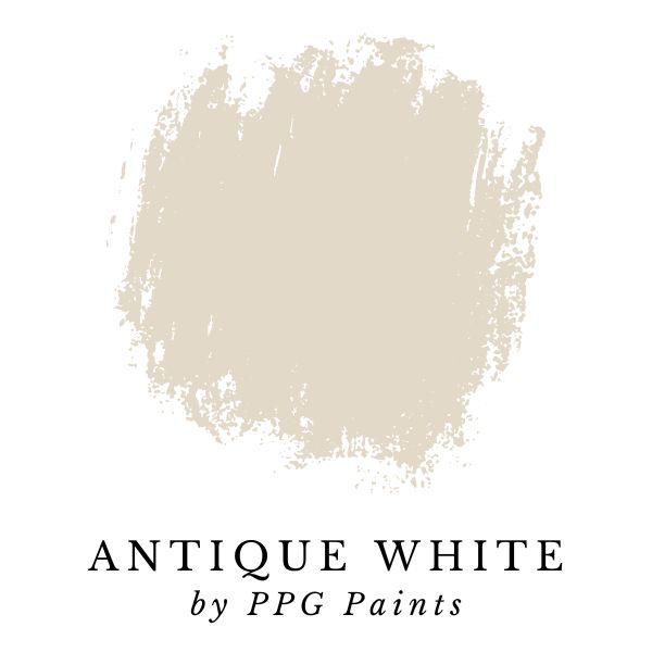
Antique White is a stunning off-white paint color that’s the perfect shade for dipping your toes into painting your home white. With a LRV of 72, you’ll notice right away this is definitely an off-white color. However, it still feels like white and doesn’t end up looking like a neutral or gray color in most rooms.
If you’re starting to love this warm off-white paint color, you aren’t alone. PPG is the second largest manufacturer of paint in the world, and this is one of their most popular paint colors.
Here’s how PPG describes Antique White:
“Antique White is a light, gray, caramel white with a bronze undertone. It is a perfect paint color for an elegant statement in any room. Pair it with gray or beige to create an elegant historical statement in any room.”
PPG Paints
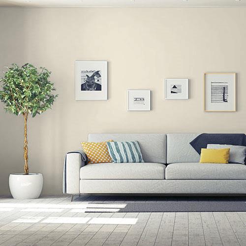
This bright living room with lots of natural light is perfect for PPG’s Antique White paint color.
Alabaster (SW 7008) by Sherwin-Williams
Alabaster – LRV: 82 (LRV, or Light Reflectance Value is a scale commonly used by design professionals where 0 = absolute black and 100 is pure white.)
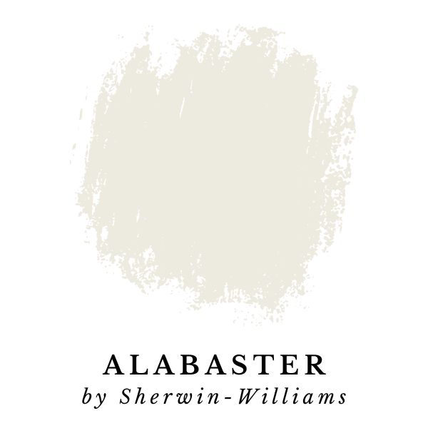
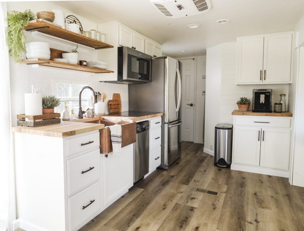
Alabaster (SW 7008) was the Sherwin-Williams color of the year a few years back, and for good reason. It’s a beautiful white with dusty undertones that make it a really versatile color for interiors. It looks good in kitchens, bedrooms, and bathrooms.
In fact, I used Alabaster throughout our entire renovated RV. It has quickly become one of my very favorite white paint colors.
Jackie Jordan, the Sherwin-Williams director of color marketing describes Alabaster as:
When you want the brightness of a white without sacrificing a warm coziness, try this soft, warm but balanced white. And turn up the peaceful.
Sherwin-Williams
Compared to White Dove, Alabaster is less creamy and more of a true white. This makes it a great option if you are looking for a naturally flattering hue with little undertone.
I love how the Sherwin Williams’ director of color marketing describes it, “Alabaster is neither stark nor overly warm, but rather an understated and alluring hue of white.”
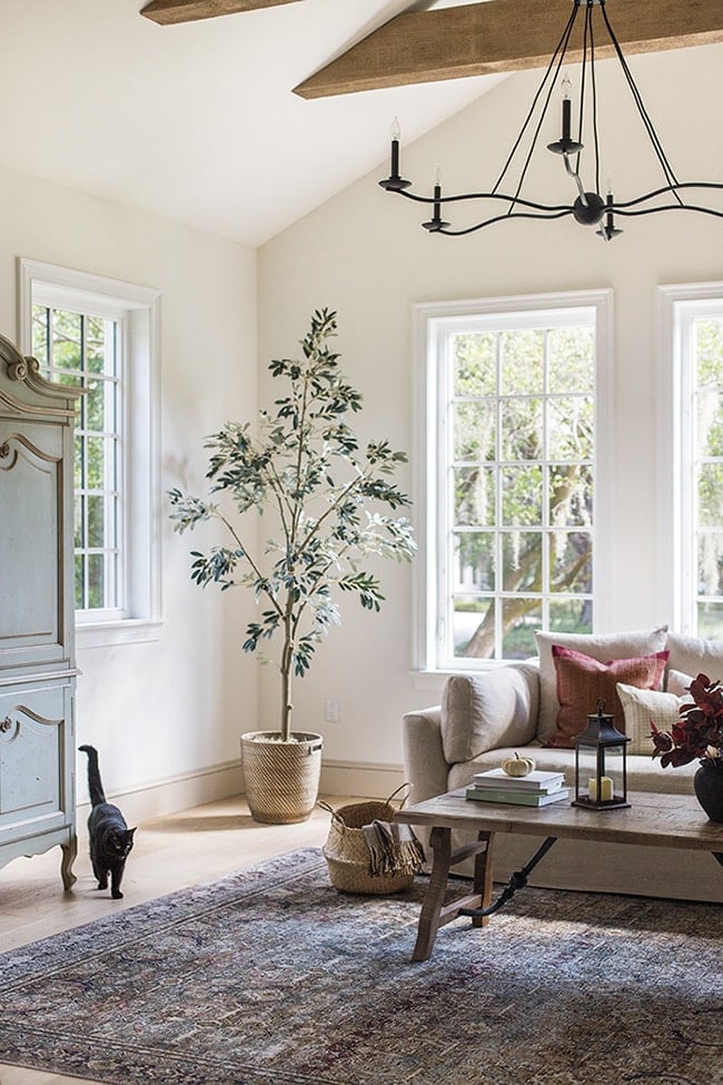
Alabaster in a living room.
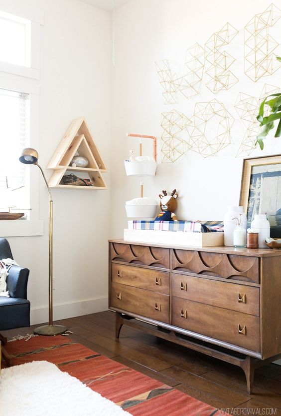
Alabaster in a bedroom.
FAQ: Alabaster or White Dove?
Sherwin Williams Alabaster vs Benjamin Moore White Dove


Sherwin Williams Alabaster and Benjamin Moore White dove are two of the very most popular white paint colors – they’re both beautiful!
Each of these white paint colors fall into what I consider the sweet spot for brightness (low to mid 80’s on the LRV scale). White Dove is slightly brighter than Alabaster with LRVs of 83.16 and 82 respectively.
When I was choosing a paint color for my home, Sherwin Williams Alabaster vs Benjamin Moore White Dove ended up being my two finalists.
Personally, I love both colors. Alabaster is slightly warmer, and White Dove is slightly cooler. Because of this difference, one color might be better suited for your specific home based on natural lighting conditions, and the other colors in a room.
Simply White (OC-117) by Benjamin Moore
Simply White – LRV: 89.52 (LRV, or Light Reflectance Value is a scale commonly used by design professionals where 0 = absolute black and 100 is pure white.)
Also known as Benjamin Moore: 2143-70
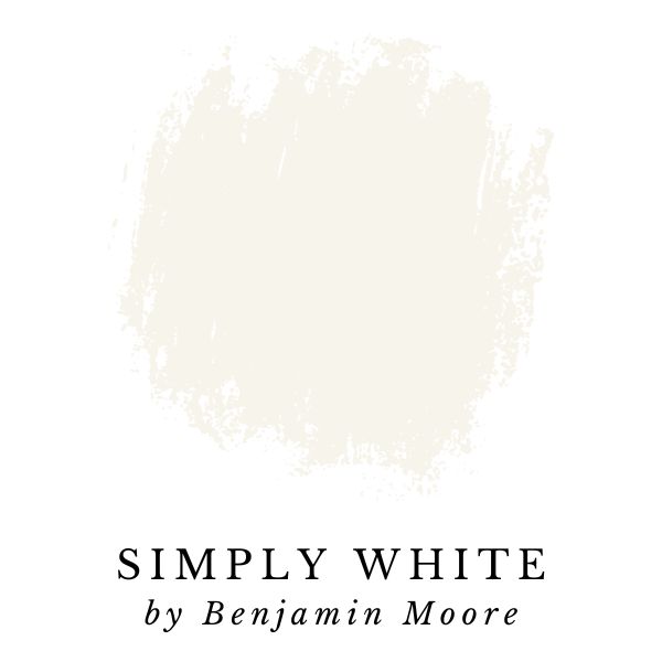
If you do any research about white paint colors you’re sure to come across the color Simply White by Benjamin Moore. It was the Benjamin Moore color of the year in 2016, and for good reason!
This color is a crisp, clean, and bright white. Simply White’s fresh finish makes it a great option for bright trim, doors, or cabinets.
The slightest hint of warmth makes this clean, crisp white a favorite to use anywhere in the home.
Benjamin Moore
Simply White has a LRV of 89.52, which is nearly the highest of all the paint colors on this list. The high LRV means it is the closest to pure white.
Around 90 is as close to pure white as I recommend going; any whiter and the colors start looking cool, sterile, and lack complexity.
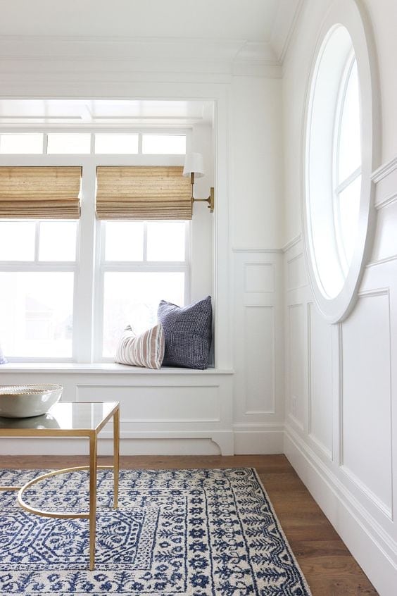
The sitting room below is painted with Benjamin Moore Simply White.
Silos White by Magnolia Homes
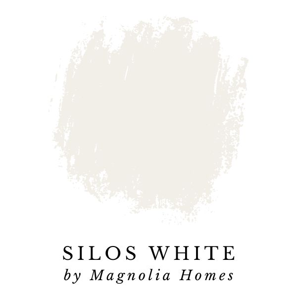
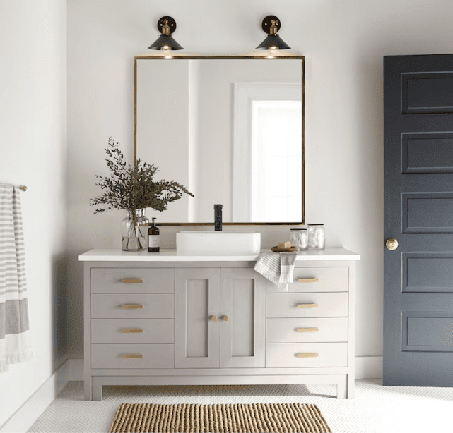
I couldn’t write a post about paint without including one from the Magnolia line. All of Joanna’s colors are beautiful (just like everything else she creates), but my favorite white from her collection is Silos White.
Joanna Gaines describes this color as a warm white with beige undertones. I tend to lean towards the warmer whites (or off-whites) because I love the bright and airy feeling they give off without the stark and sterile vibe that a pure white tends to create.
The dining room in the image below is painted with Magnolia Homes Silos White.
Super White (OC-152) by Benjamin Moore
Super White – LRV: 87.36 (LRV, or Light Reflectance Value is a scale commonly used by design professionals where 0 = absolute black and 100 is pure white.)
Also known as Benjamin Moore: PM-1
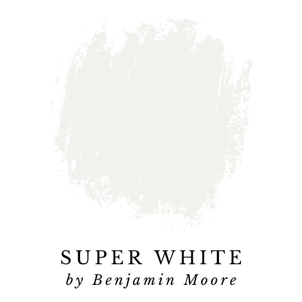
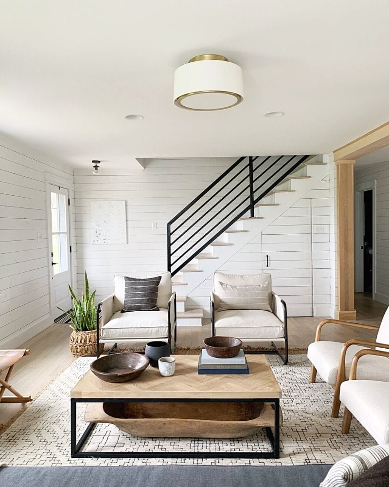
Super White by Benjamin Moore is the most basic, classic color on this list, but that isn’t a bad thing! I love the simple, clean white because it appears very pure without coming across as blinding.
“A radiant, slightly cool shade of white that suggests clarity and simplicity.”
Benjamin Moore
Super White has color depth and less undertones than all the other white paints I recommend. Many true whites tend to be overly cool and bright, but not Super White.
How does it do it? With a LRV of 87.36, it accomplishes the ‘white as snow’ look without making you feel like you just checked your phone in the middle of the night with the screen set on max brightness.
The shiplap walls of the living room in the image below are painted with Super White by Benjamin Moore.
Creamy White (OC-7) by Benjamin Moore
Creamy White – LRV: 70.95 (LRV, or Light Reflectance Value is a scale commonly used by design professionals where 0 = absolute black and 100 is pure white.)
Also known as Benjamin Moore – Spring in Aspen (954)
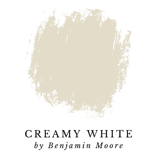
Creamy White by Benjamin Moore has the lowest LRV, and the most warm, off-white undertones of all the paint colors on this list. While most of the colors included in this white paint color guide are close to true white, this is not the case when it comes to ‘Creamy White’ – it’s more of an off-white.
The color might be for you if you’re interested in a more sophisticated color compared to pure white, but don’t want to go full-on beige or grey. With Creamy White, you can still expect a clean looking off-white color.
It’s also a great choice for rooms with north-facing windows that let in cool northern light. The light from north-facing windows has a tendency to bring out the blue undertones in cool and neutral white paint colors. Using a warmer white, like Creaming White will prevent this from happening.
Related: Best Paint Colors for North-Facing Rooms
The warm vibes of Benjamin Moore’s Creamy White would be an excellent color choice to make a bedroom, guest room, or common area feel extra inviting.
“A warm, gentle bisque hue that makes any space look relaxed and welcoming.”
Benjamin Moore
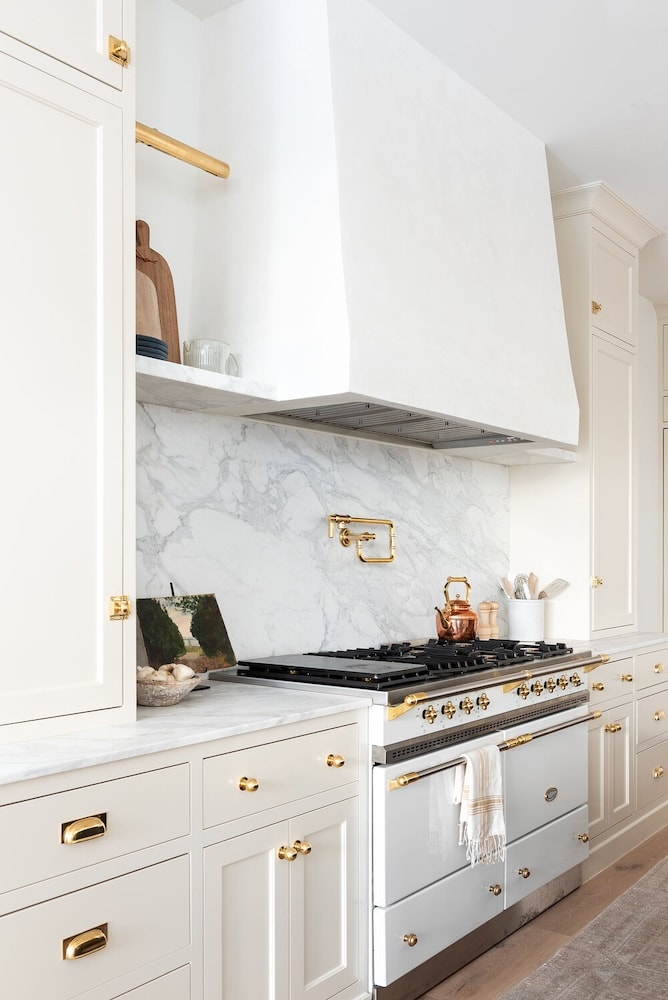
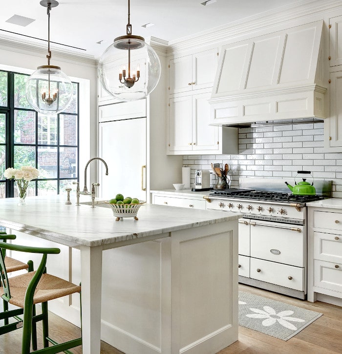
Creamy White on the kitchen cabinets below creates a warm cozy vibe while still looking fresh & clean.
Chantilly Lace (OC-65) by Benjamin Moore
Chantilly Lace – LRV: 90.04 (LRV, or Light Reflectance Value is a scale commonly used by design professionals where 0 = absolute black and 100 is pure white.)
Also known as Benjamin Moore: 2121-70
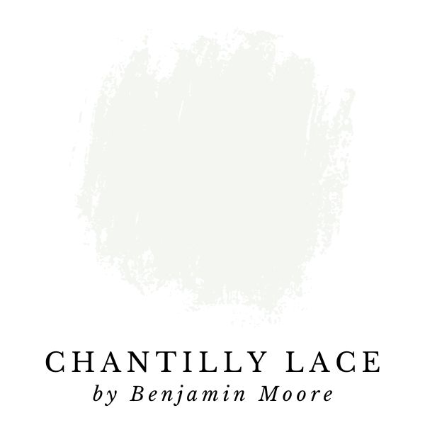
Chantilly Lace is one of my favorite colors, and it has been gaining popularity. It’s a pleasant bright white paint color with an understated hint of cool greenish hue.
Don’t be scared of the greenish undertones – it’s just enough to give this paint color a unique appeal that can add character and interest to a room.
“A classic go-to white that elicits images of fresh cotton and pure silk.”
Benjamin Moore
With a high LRV of 90.04, this color is a very bright, pure white. It’s the brightest white paint color on this list making it a great neutral white paint color.
Ninety is my upper limit for white paint colors that I’ll recommend; once you get above 90, colors usually start looking washed out, sterile or just plain boring.
You can see how crisp and bright Chantilly Lace looks as an exterior white paint color option in the image below.
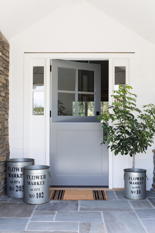
Snowbound (SW 7004) by Sherwin-Williams
Snowbound – LRV: 83 (LRV, or Light Reflectance Value is a scale commonly used by design professionals where 0 = absolute black and 100 is pure white.)
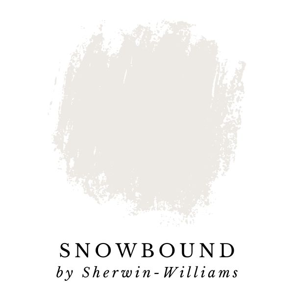
Snowbound by Sherwin Williams is featured in their Top 50 Color rankings. It’s also included in the following color collections: Minimalist, Pottery Barn – Fall/Winter 2021, Living Well – Reflect, Top 50 Colors, and Timeless White.
This popular new paint color is light, bright, and has a hint of silvery gray. Its ideal for trim, but also makes an excellent color for walls and ceilings if you’re looking to keep things light and airy.
Snowbound is a cool, neutral white paint color with some gray undertones. This means that Snowbound could be a good choice for nearly any room.
“With its slight gray undertone, this versatile cool white pairs well with other gray-influenced colors. Like stepping into a snowy glade.”
Sherwin-Williams
Pure White (SW 7005) by Sherwin-Williams
Pure White – LRV: 84 (LRV, or Light Reflectance Value is a scale commonly used by design professionals where 0 = absolute black and 100 is pure white.)
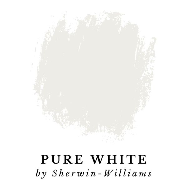
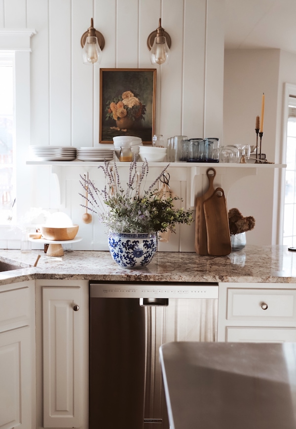
Pure White by Sherwin Williams is a light white paint color, and it’s a perfect neutral backdrop that will make all the other colors in your home pop.
“This versatile, bright white has the slightest yellow undertone that keeps it from appearing too stark. Use on trim for the perfect complement.”
Sherwin-Williams
Pure White by Sherwin-Williams is another top tier white paint color. It’s perfect for walls, trim and ceilings – but my favorite use for Pure White is on kitchen cabinets! Check out the amazing kitchen below!
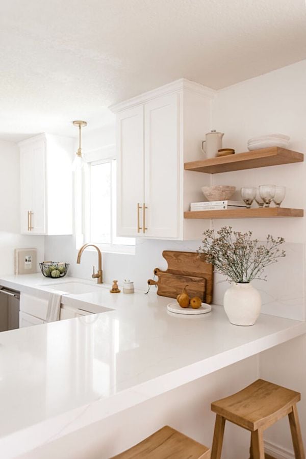
Atrium White (OC-145) by Benjamin Moore
Atrium White – LRV: 85.08 (LRV, or Light Reflectance Value is a scale commonly used by design professionals where 0 = absolute black and 100 is pure white.)
Also known as Benjamin Moore: Alabaster OC-129, 876, PM-13
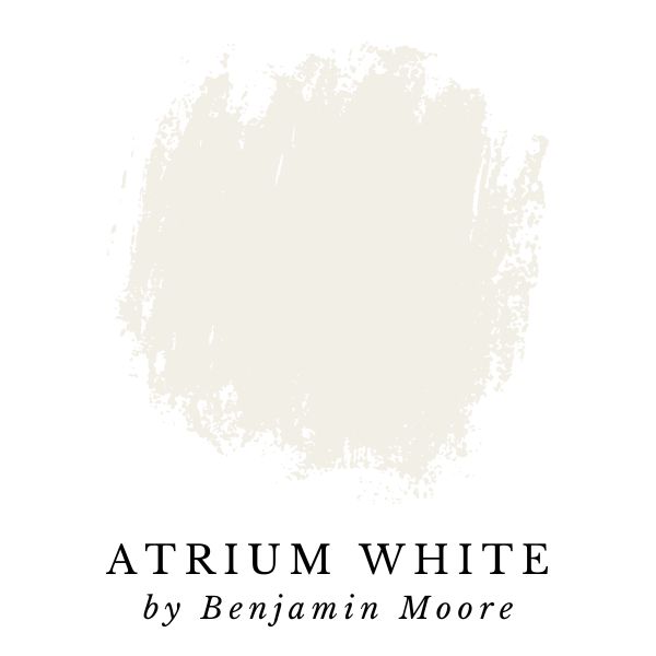
Atrium White by Benjamin Moore is a bright creamy white paint color. According to Benjamin Moore, it has a flattering touch of pink.
In most lighting, this paint color will have a true white appearance that is perfect for creating a light and airy vibe in any room.
As with many Benjamin Moore paint colors, Atrium White has several different color codes, and multiple names. To add to the confusion, one of Atrium White’s alias names is “Alabaster”. Don’t confuse this with the extremely popular Sherwin-Williams color.
“A fresh, youthful white with a flattering touch of pink.”
Benjamin Moore
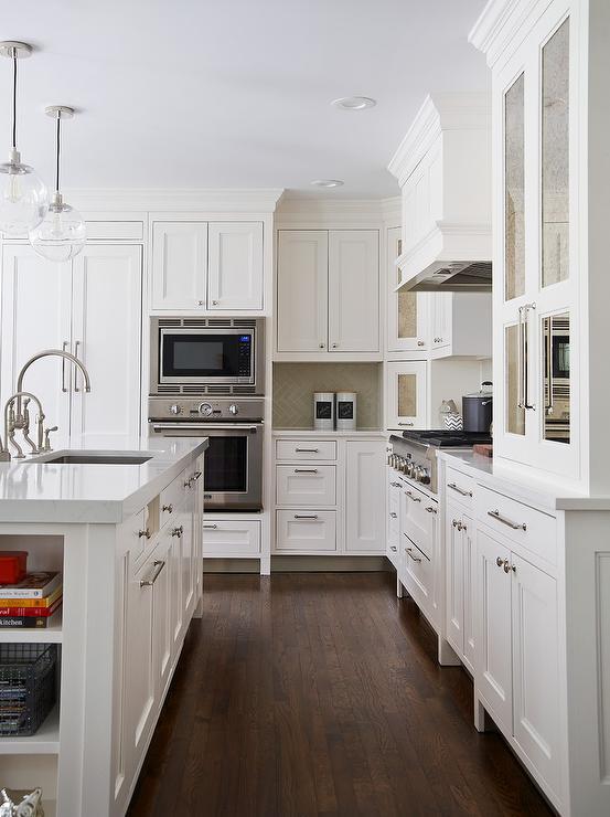
In the kitchen below, the cabinets are painted with Atrium White by Benjamin Moore, and they’re stunning!
Still can’t decide? Easily order samples of all the paint colors from this article.
There you have it, my top picks for best white paint colors. I hope you found this article helpful and now have a few colors in mind to try out in your space.
Want my A-to-Z blueprint on how to design a room that’s beautiful and stylish?
My Top Painting Tips & Resources:
The easiest way to see paint samples on YOUR walls:
Before you make a final decision on a paint color, test out your favorites with Peel-and-Stick paint samples from Samplize! The 9” x 14.75” Peel-and-Stick samples use real paint, and make it easy see how a color will look in your home (without the mess).
Plus, it saves you the trouble of having to pick up multiple tiny cans of paint that end up going to waste.
Check out my full Samplize Review where I share about my experience using Samplize to help me decide on a paint color.
Samplize allows you to see paint colors options in a variety of locations. The peel-and-stick squares have non-damaging adhesive that you can reposition many times, and can even wrap around corners to show contrast between walls.
Testing out a paint color in your home is important because a paint color’s appearance depends on the unique lighting conditions in your home.
A paint color can even look a little different throughout the day as lighting conditions shift with the sun’s position in the sky.
Related: Best Paint Colors for North-Facing Rooms
Make sure to examine your paint sample during different times of the day to see how natural light affects the appearance of the color.
Tip: Don’t forget to see how the paint colors look with the lights on (and off!) in the room you’ll be painting.
How To Choose A Paint Color
Want to know exactly how to pick the best paint color for your space? How do you know which color of white is the best fit for your home, your decor, the lighting in your home, and your style?
I wrote an entire blog post with easy to follow steps for choosing a paint color that answers all these questions, and more.
Check it out here: How To Choose the PERFECT Paint Color Using Undertones, Lighting, & Sheen
It has all the info you need to know – from undertones, sheen, to the lighting in a room, and so much more.
Our Go-To Painting Supplies
- Paint brushes – I recommend ‘Pro Grade’ paint brushes, they’re the perfect budget-friendly option. This set comes with both flat and angled brushes to get every nook and cranny. I LOVE the quality and, in my experience, they’re much more affordable from Amazon compared to in-store prices.
- Paint rollers – Cover more surface area with a handy roller.
- Glidden Premium paint from The Home Depot – save money by color matching any premium Benjamin Moore or Sherwin Williams paint colors, and use this instead!
- Paint sprayer – Paint brushes and paint rollers will get the job done, but for serious efficiency and productivity, you cannot beat this Graco Magnum Project Plus airless paint sprayer. I personally own this paint sprayer and have used it on tons of painting projects.
It’s an excellent quality sprayer, and powers through any painting projects in a hurry. Painting with an airless sprayer makes it easy to complete projects in much less time.
- Drop cloth – Skip the mess and grab a reusable drop cloth instead. This will come in handy for future projects. Just pop it in the washing machine after you’re done painting and it will be ready to go for the next project.
- Multi-surface painter’s tape – I always use this brand of painter’s tape, it’s great for smooth or lightly textured walls, trim, baseboards, tile, or even glass. It sticks quick and is easy to remove.
- Sanding sponges – For smoothing and prepping surfaces, you’ll need a couple of sanding sponges in different grits.
Get the printer-friendly version of the post!
I have everything you need in this post to choose a white paint color. But it’s a long read… This is why I offer a printer-friendly eBook version for only $5 so you can save, print, and refer to it anytime, ad-free! (images included)
Plus, I made a quick reference list of all the paint colors from this post together on one page (page 43) so you can easily take to the store with you. Grab your copy by clicking the button below.
Looking for more paint color guides?
If you found this white paint color guide helpful you may also enjoy reading through my Gray Paint Color Guide blog post.
In the post I’ve broken it down into four categories: Neutral Gray, Warm Gray, Cool Gray, and Dark Gray.
Another popular interior paint color is green. In fact I think green will continue to be one of the top paint colors going into next year.
But, many people who want to paint their walls (or cabinets) green are concerned that green might not flow with the rest of their home.
I spent tons of hours researching, as well as asking many of my readers what their favorite options were. After compiling all the results, I’m shared a blog post with all the best green paint colors!
My Other Paint Color Resources
Helping people choose great paint colors is one of my passions! I’ve written several articles to help streamline and destress your decision-making process.
Check all of them out here:
- White Dove Paint Color Review | After Painting My Whole House!
- Paint Color Trends | Trending Colors From Top Brands
- Best Paint Colors For North-Facing Rooms
- How To Choose A Paint Color | Lighting, Undertones, Sheen (and more!)
- Samplize Review | Peel-and-Stick Paint Samples
- Green Paint Color Guide | Most Popular Colors
Thanks for reading along! If you have any questions, please ask in the comments below!





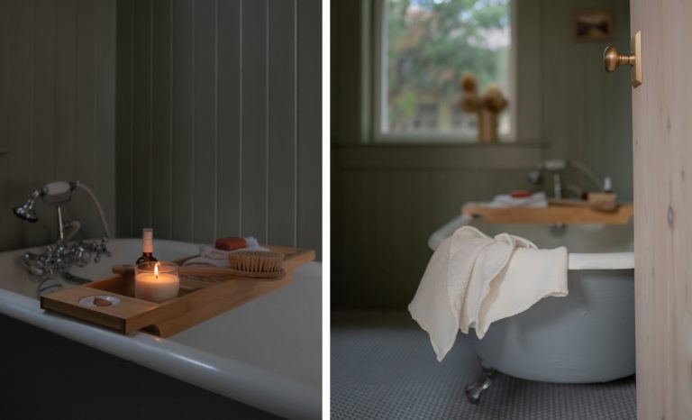


Hi! I’m painting a rather large half bathroom. And by rather large, I mean it could have easily been a full bathroom with tub. The lower half ofvthe walls will be black board snd batten. The vanity is currently white,but may be painted black. There is no window, so no natural light. Ther is slso no over the mirror light, only 2 ceiling light fixtures. I’m considering White Dove for the upper half of the walls. I’d like a sharp contrast between the black and white, but because it’s artificial light in there, I don’t want it too stark.
Would White Dove have too much of a yellow cast next to black?
I don’t think it will look too Yello especially if you choose the right light bulbs for your lighting. Checkout this post I wrote all about led lights and color temperature.
Thanks for the reply. I actually went with Benjamin Moore Simply White which was the Color of the Year in 2015. It’s a gorgeous shade of white.
Hi Ashley. I just bought a 20 year old home. The wainscoting and trim are Alabaster White and the walls are SW Nice White, which has pink undertones especially at night. The floors are honey oak. I heard blush colors are going to be popular this decade. Should I paint my whole house and ceilings BM Swiss Coffee or Pale Oak with the honey oak floors and cabinetry? Or leave the SW Nice White paint on the whiles and paint my cabinets white?
I think Swiss coffee and pale oak would look great, two of my favorite colors! But if the blush tones don’t bother you, I think that sounds like a nice look!
Hi,
I, too, am enjoying reading your article as well as the q/a section. Kids are gone, so, we are slowly freshening up the rooms to be guest rooms. The furniture is medium wood, I’m going to purchase white bedding and pop of color will be pillows (tbd). There is walnut stained wood trim at the baseboards, around the windows, and the two doors. There is no design interest to the room- simply a box. I want to keep the room light. So, I am leaning towards White Dove and Decorators White. My question is: I read that to create a nice effect, use the same color on walls and ceiling but with a different sheen. Can you address this for me, Please.
I haven’t tried that but it could look great. I usually stick with the same sheen in a room for simplicitys sake!
I am painting my living room and dining room that are connected rooms. The color coming off my kitchen in Monroe Bisque(BM). I have Believable Buff (SW)next to the living room on an accent wall in the entry way. The rest of the house is in Monroe Bisque and I really can’t change all of the house. The floors are a mid-tone chestnut colored hardwood. Do you have a suggestion for a blending warm color that will help freshen and lighten the two rooms? I have large windows on both sides of the room facing east and west. I have nice moldings that I would still like to contrast. Do you have any suggestions for someone that does not have a grey color palate?
Take a look at my gray paint guide as well as the tips in this post for choosing a color based on undertones and lighting.
I like your descriptions of whites and have been able to figure out that I need Ben Moore Super white for majority of walls in contemporary home. But in the Master bedroom I am using a dark gray Italian veneer panel across 1 wall and medium gray wall covering and Ben Moore Silver Bells 1458 on 2 walls. Please tell me what Color White paint u would use for ceiling. The room looks Contemporary Italian ala Minotti.
Possibly Alabaster or simply white. Checkout the tips I listed in this post to help you decide.