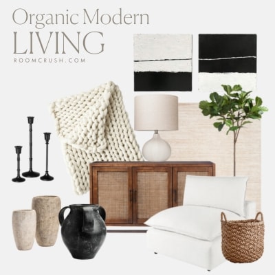
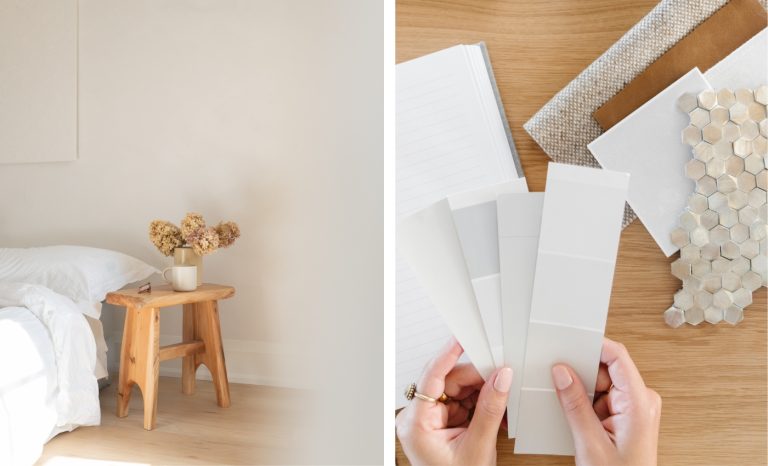
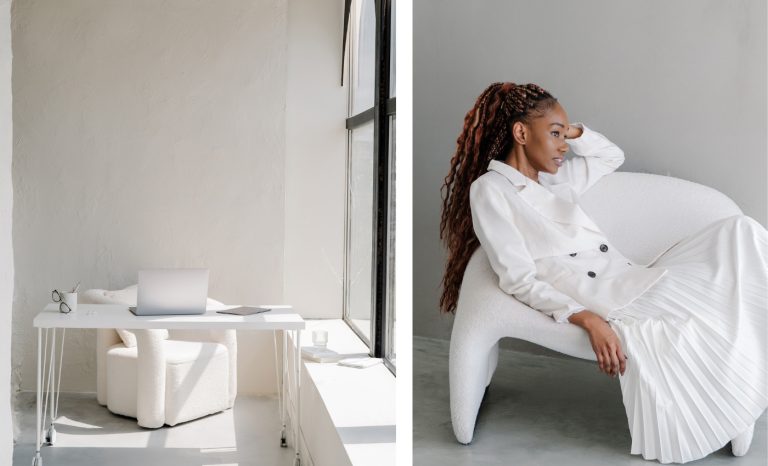
Agreeable Gray by Sherwin-Williams | Paint Color Review
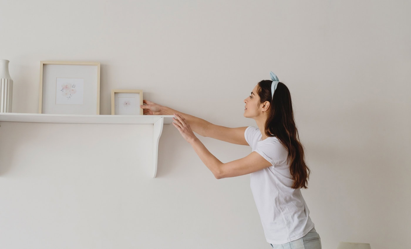
Agreeable Gray by Sherwin-Williams is a near-perfect gray paint color. See it in REAL spaces and find out how and where to use it best!

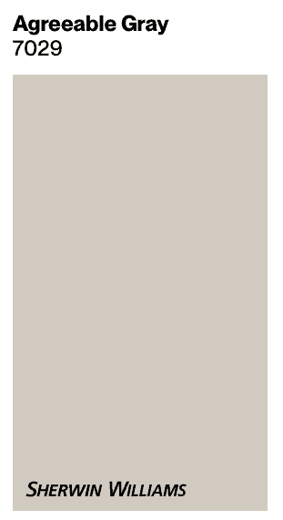
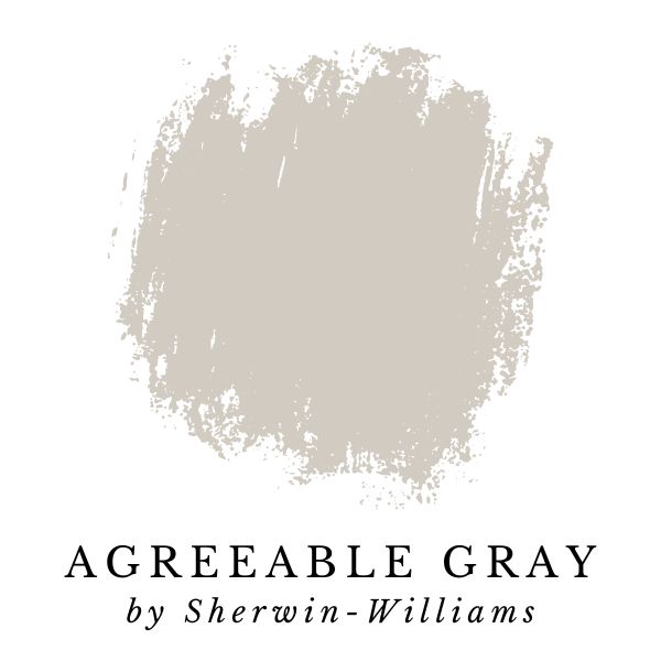
Sherwin-Williams Agreeable Gray (SW 7029) is a beautiful gray paint with a little more warmth and color than a traditional gray. It’s perfect for almost any room! This extremely popular gray can help create an interesting yet relaxed vibe in your home.
Agreeable Gray (SW 7029)
Agreeable Gray – LRV: 60 (LRV, or Light Reflectance Value is a scale commonly used by design professionals where 0 = absolute black and 100 is pure white.)
This site uses ads and affiliate content as an Amazon associate earning on qualifying purchases. Disclosure.
In this paint color review, I’m going to share my personal experience with Sherwin-Williams Agreeable Gray, and all the nitty gritty details about undertones, brightness, and how it looks with different lighting.
Plus, I’m sharing photos of Agreeable Gray in real homes!
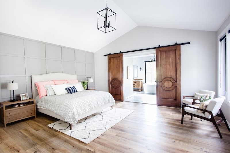
If you’ve been thinking about using Agreeable Gray for your next paint project, here’s everything you need to know to decide if it’s the right gray paint for your space.
What Type of Color is Agreeable Gray
Is it gray greige or beige? Agreeable Gray is an in-between color that fits into multiple categories, but it’s really not beige. It can be labeled as a warm gray, or greige, but on a technical level, it’s most accurately described as gray-taupe.
This color profile makes Agreeable Gray extremely versatile. It deals well with both Northern & Southern light (more on that later), and tends to fit in with most interior finishes and other design elements in your home.
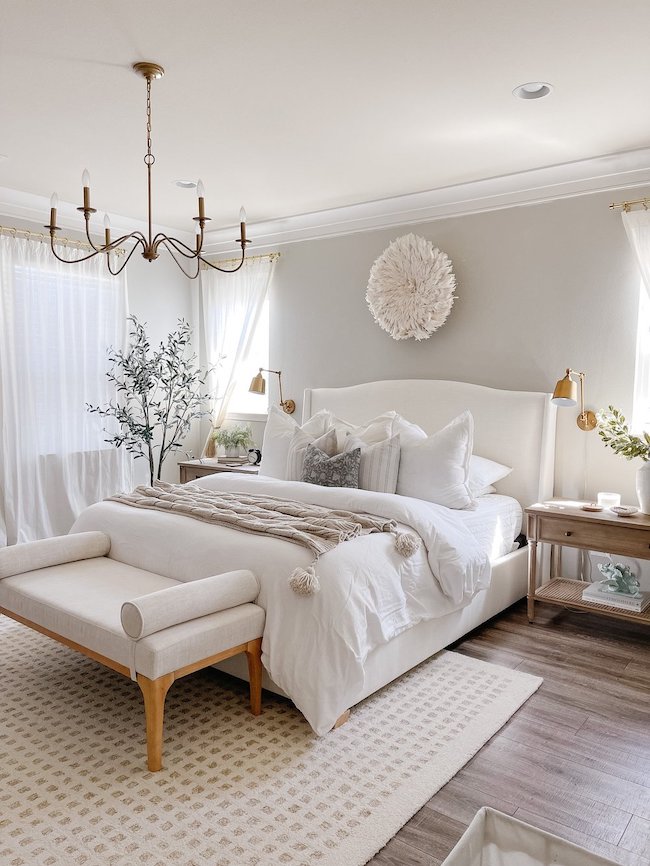
Is Agreeable Gray Still popular in 2025?
Yes! Agreeable Gray is Sherwin-Williams’ most popular color in 2025. This paint color has spent a ton of time at the top – it’s been several years running as the best selling paint color by Sherwin-Williams, and for good reason.
Agreeable Gray is a beautiful color with broad appeal. It looks great in almost any room, which is part of the reason why it’s still so popular.
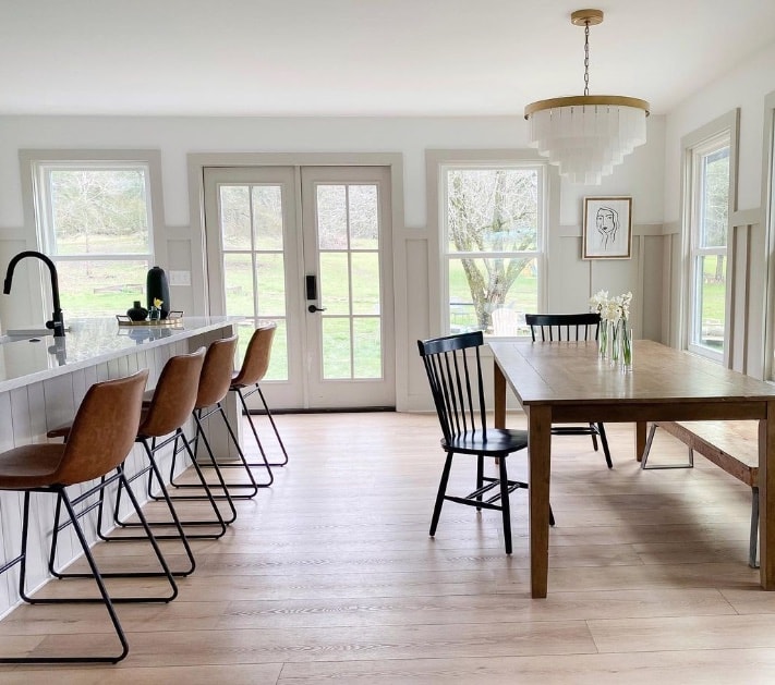
What Is The Undertone of Agreeable Gray?
Agreeable Gray has minimal undertones. In most lighting conditions, it appears true to expectations and registers as having zero undertone. But, it’s not quite that simple. At the extremes, it can look either violet, or green (although very subtly) – let me explain.
When it comes to undertones, there’s a few things that you have to keep in mind. The color temperature of the light in a room (warm / cool), AND the other colors in the room will both have an impact on the appearance of a paint color.
Agreeable Gray in Northern Light
In a room illuminated with cool northern light, Agreeable Gray leans more into its gray roots. Northern light subdues some of the warm hints of taupe. What’s left is a classy neutral true gray.
In the image blew, Northern light is pouring in from the left side of the room.
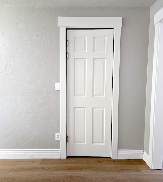
Agreeable Gray in Southern Light
Southern light is warm, and gives Agreeable Gray’s appearance a gentle shove toward warmth. In Southern light, Agreeable Gray tends to look like a warm soft greige-taupe without any unwanted green or violet undertones.
Does Agreeable Gray Ever Look Purple?
No. Agreeable Gray doesn’t have the color to look purple in a room all by itself. However, when you start adding outside influences such as artificial lighting, and different colors from flooring, trim, and furniture… anything is possible.
Gray is very susceptible to color shift, so it’s possible for Agreeable Gray to get a subtle violet undertone (purple and pink are less likely).
Does Agreeable Gray Look Green?
When it comes to gray and greige paint colors, undertones are unavoidable. Gray is so neutral (without color) that it tends to latch onto the colors that surround it.
It’s possible for Agreeable Gray to appear every so slightly green with the right combination of lighting and other colors surrounding it – but it’s pretty rare. This isn’t something I would worry about.
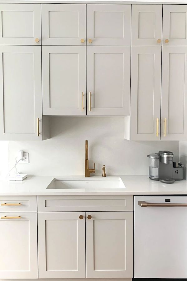
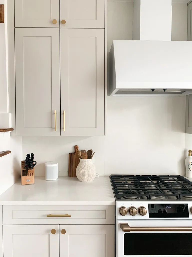
Agreeable Gray on Kitchen Cabinets
Agreeable Gray is a very popular choice for cabinets and kitchens. It’s warm undertones and versatility make it such a pretty option. Pair it with brass or black hardware for a modern look.
Test Out Agreeable Gray In Your Home!
All this talk about undertones leads me to my next point: always be sure to test out colors in your home – especially gray.
Every room has unique lighting, finishes and decor, so you can never be 100% certain how a color will look in your home until you see it in person.
Wait! There’s A SMARTER Way To Test paint Colors at Home
Let’s be honest. Buying tiny sample pots, and painting test squares on the walls is a hassle!
For the easiest, mess-free way to sample paint colors in your home, I recommend using Peel-and-Stick paint samples from Samplize.
I’ve been using Samplize myself for years, and I absolutely love recommending them – it’s really a game changer.
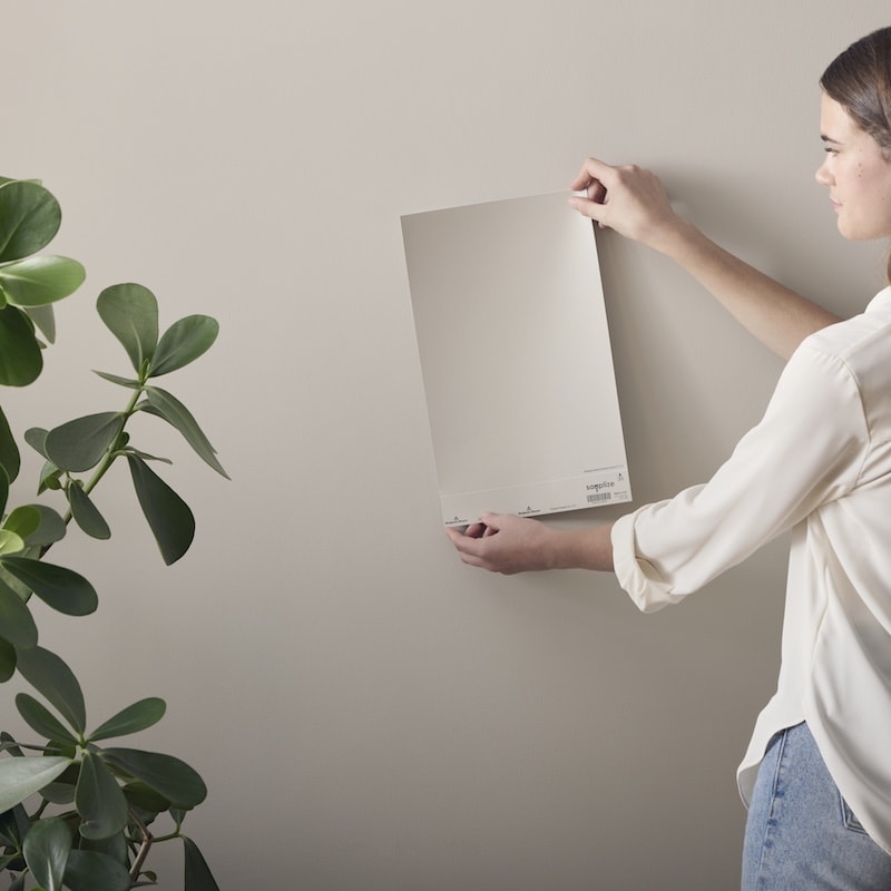
The vinyl peel-and-stick samples make it easy to test out paint colors on multiple different walls, and in different rooms. This helps you a get thorough understanding of what a paint color will look like in your home.
Tip: check out at your paint color sample at different times of day.
Grab your sample of Agreeable Gray from Samplize today!
My Personal Experience With Agreeable Gray
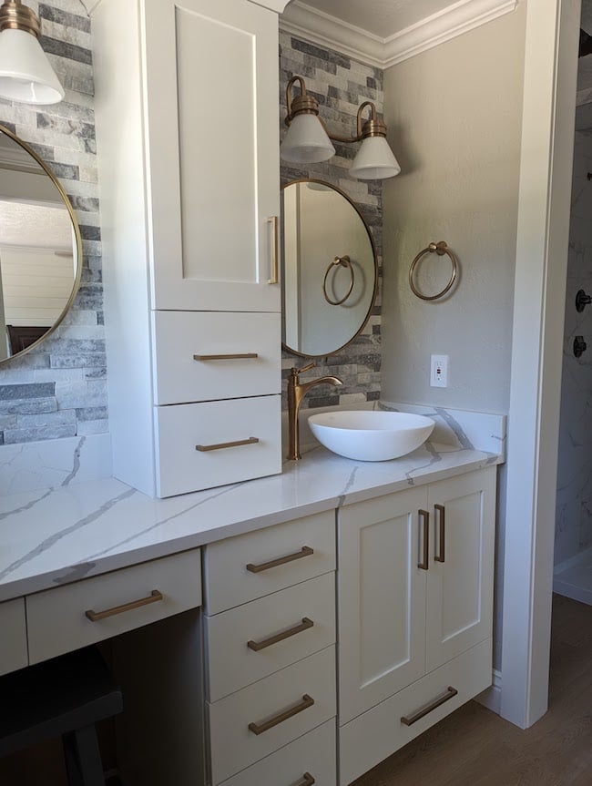
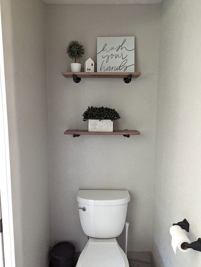
A client of mine was working on an extensive remodel of their 1970’s era home. They had the perfect kitchen all picked out, as well as flooring, and other finishes – but they needed the perfect wall color to tie everything together.
When I saw the Pinterest idea boards, and design sketches, I immediately had a gut feeling that Agreeable Gray was going to be the one.
After testing out the paint color out in their home (with Peel-and-Stick Samples from Samplize of course) it was obvious that Agreeable Gray was meant to be!
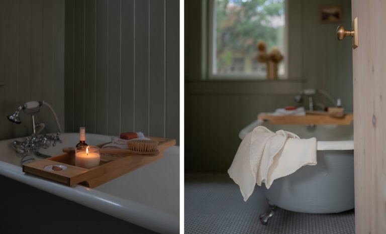
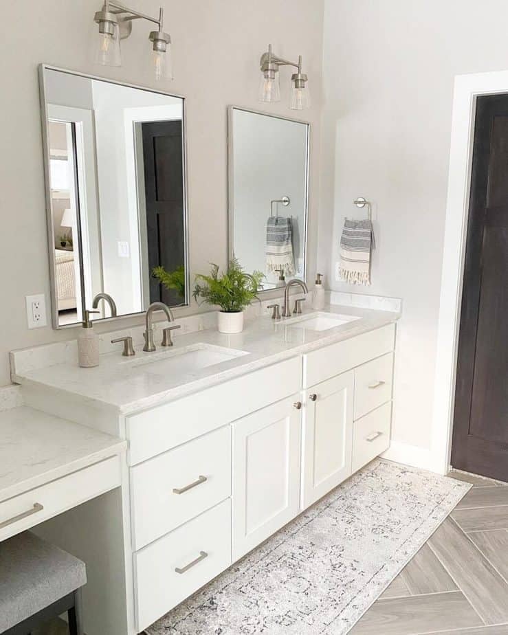
Check out how the bathroom turned out:
How Bright is Agreeable Gray
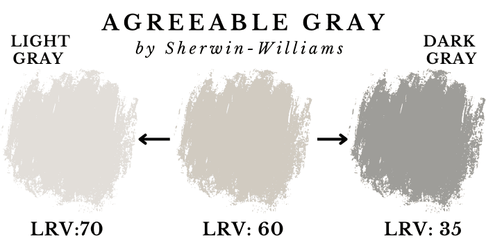
Sherwin-Williams Agreeable Gray has a LRV of 60, which is a really nice medium-brightness for a gray paint color.
If you aren’t familiar with LRVs, don’t worry. It’s really simple. LRV stands for Light Reflectance Value. It’s a scale commonly used by design professionals where 0 is absolute black and 100 is pure white.
Agreeable Gray sits right in the sweet spot of brightness for gray paint colors. It has enough depth of color to appear rich and complex, but it’s still bright and can help a room to feel light and airy – especially if there’s lots of natural light.
To put Agreeable Gray’s LRV of 60 in context: The LRV of a medium-dark gray is around 35, and an extremely light gray has a LRV of about 70 (any higher and it becomes off-white).
Looking for a darker, or lighter gray paint color? Check out my Gray Paint Color Guide.
Agreeable Gray vs Repose Gray
Agreeable Gray and Repose Gray are similar colors, both from Sherwin-Williams. They are extremely close in brightness (LRV 60 and 58).
What differentiates these two paint colors is the color profile. Repose Gray is a true neutral gray, whereas Agreeable Gray definitely has a little bit more warmth and color.

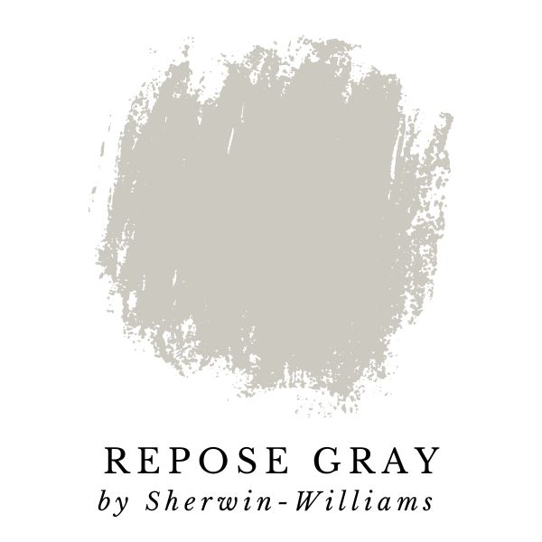
In the side-by-side images, you can see how Agreeable Gray looks more taupe-brown compared to Repose Gray.
Agreeable Gray Coordinating Colors
Agreeable Gray by Sherwin-Williams is fairly neutral, which makes it easy to coordinate with a wide variety of trim, wall, and accent colors.
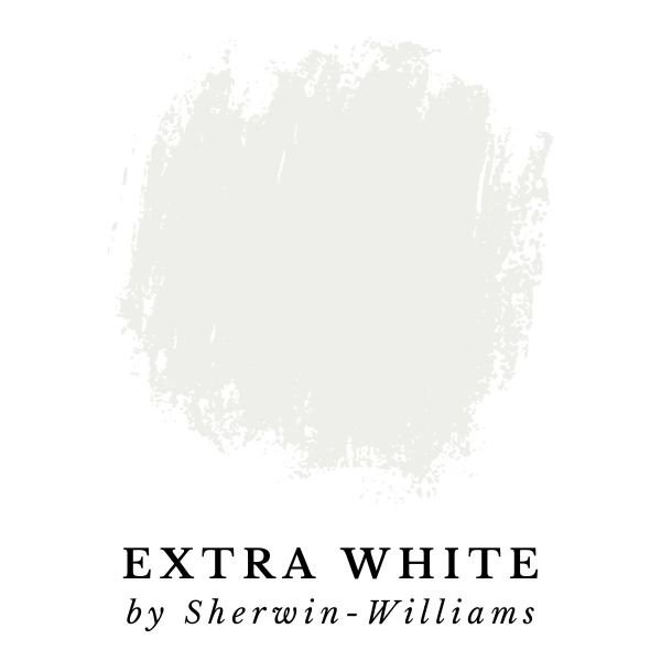
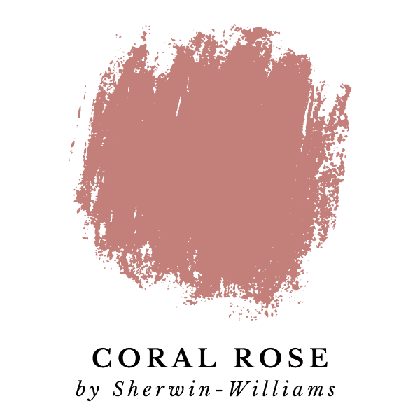
Here are Sherwin-Williams top three picks for colors that coordinate well with Agreeable Gray. Click the links or images below to get Peel-and-Stick samples from Samplize.
- Incredible White (SW 7028)
- Extra White (SW 7006)
- Coral Rose (SW 9004)
Our Top Painting Tips & Resources:
How To Get A Great Deal On Paint
Did you know that you can use budget-friendly paint, and have it color matched to premium Benjamin Moore or Sherwin Williams paint colors? At Joyfully Growing Blog, we always use Glidden Premium paint from The Home Depot.
Glidden Premium rivals the quality of the top paint lines from Behr, Sherwin Williams, and Benjamin Moore.
Any paint store, or home improvement store with a paint section will be able to match colors from most major brands. This means that you can select one brand of paint, but get it mixed in any color you want!
In many cases, affordable paint like Glidden Premium can be up to 50% cheaper than the ‘big name brand’ competition. This can save you a ton of money!
Our Go-To Painting Supplies
- Paint brushes – I recommend ‘Pro Grade’ paint brushes, they’re the perfect budget-friendly option. This set comes with both flat and angled brushes to get every nook and cranny. I LOVE the quality and, in my experience, they’re much more affordable from Amazon compared to in-store prices.
- Paint rollers – Cover more surface area with a handy roller.
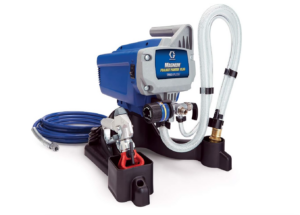
- Paint sprayer – Paint brushes and paint rollers will get the job done, but for serious efficiency and productivity, you cannot beat this Graco Magnum Project Plus airless paint sprayer. I personally own this paint sprayer and have used it on tons of painting projects.
It’s an excellent quality sprayer, and powers through any painting projects in a hurry. Painting with an airless sprayer makes it easy to complete projects in much less time.
- Drop cloth – Skip the mess and grab a reusable drop cloth instead. This will come in handy for future projects. Just pop it in the washing machine after you’re done painting and it will be ready to go for the next project.
- Multi-surface painter’s tape – I always use this brand of painter’s tape, it’s great for smooth or lightly textured walls, trim, baseboards, tile, or even glass. It sticks quick and is easy to remove.
- Sanding sponges – For smoothing and prepping surfaces, you’ll need a couple of sanding sponges in different grits.
Want my proven method for decorating a room that’s cohesive and cozy?
Final Thoughts on Agreeable Gray
Agreeable Gray by Sherwin-Williams is my absolute favorite gray paint color! If you’re on the fence still, I definitely recommend giving it a try.
More Resources For Choosing Paint Colors
If you enjoyed this Agreeable Gray paint color review, I have tons of other paint color guides & reviews to help you pick the perfect colors for your home.
Check out all of my Paint Color Resources here.
Thanks for reading along!
Up Next: Top 10 Bestselling Sherwin-Williams Paint Colors
