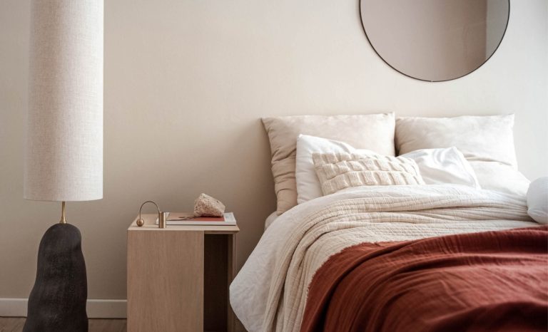
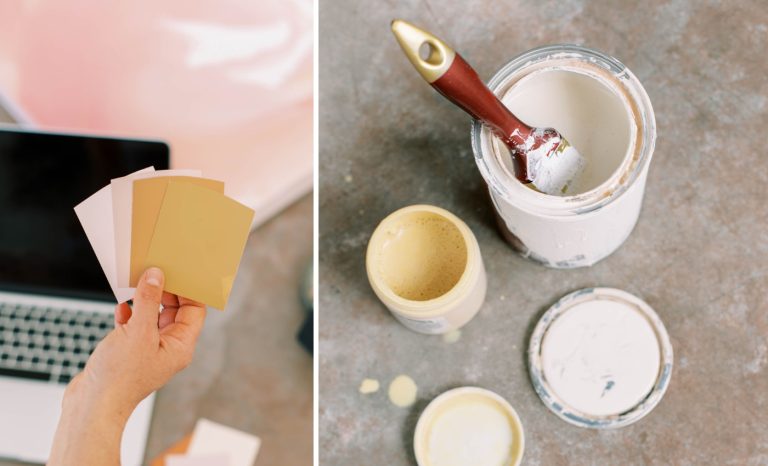
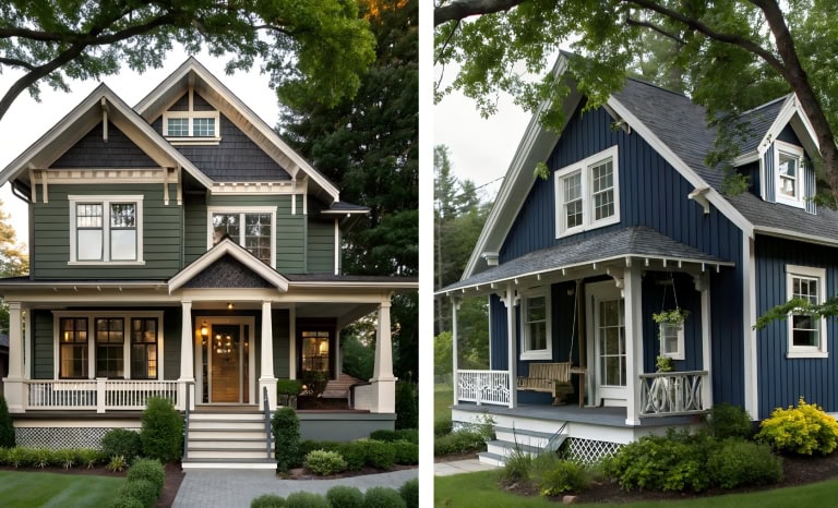
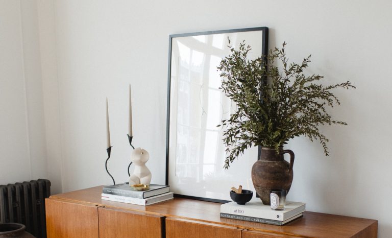
Popular Off-White Paint Colors
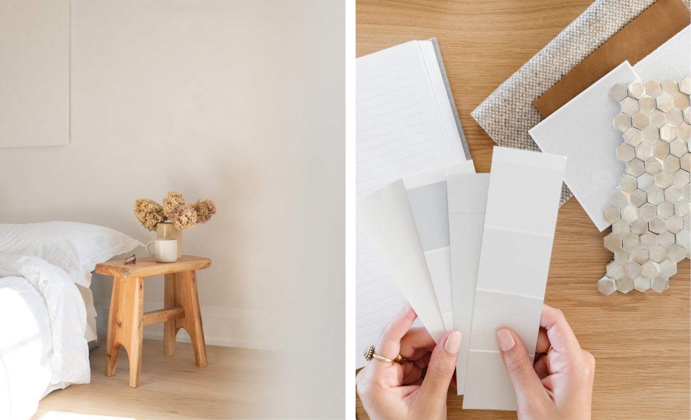
The off-white paint color family has more color depth, and are more interesting and complex compared to plain old white.
This is easily one of my paint categories. The paint colors range from barely off-white, and cream on the lighter side, up to light shades of gray, beige, and tan on the darker side. Many of these paint colors are excellent for trim & doors as well.
Best Off-White Paint Colors
Ok, let’s get into the best off-white paint colors! This is a list of my favorite popular off-white paint colors.
This site uses ads and affiliate content as an Amazon associate earning on qualifying purchases. Disclosure.
I’ve personally curated this list with the goal of finding colors that are most likely to look amazing in your home!
Calm (OC-22) by Benjamin Moore
Calm – LRV: 75.83 (LRV, or Light Reflectance Value is a scale commonly used by design professionals where 0 = absolute black and 100 is pure white.)
Also known as Benjamin Moore: 2111-70
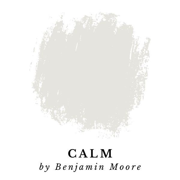
Calm by Benjamin Moore is a balanced neutral off-white paint color. The color leans slightly warm, and has a light white appearance with a hint of gray.
It has a pleasing lavender undertone that might be visible, depending on the lighting in a room. With a LRV of 75.83, Calm is bright-for-category and it feels light & airy – but it still retains plenty of color depth.
“The barest hint of lavender-gray distinguishes this soothing shade of white.”
Benjamin Moore
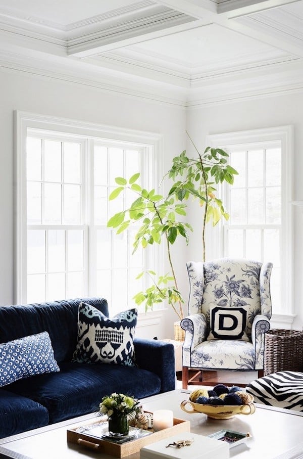
In the image below, Sue De Chiara painted the walls of this beautiful living room are painted with Calm by Benjamin Moore while the ceiling and trim are White Dove. This is an amazing combo!
Shoji White (SW 7042) by Sherwin-Williams
Shoji White – LRV: 74 (LRV, or Light Reflectance Value is a scale commonly used by design professionals where 0 = absolute black and 100 is pure white.)

Shoji White by Sherwin-Williams is a warm off-white paint color that is infused with a beautiful blend of cream, orange and gray. If Shoji White was a few shades darker, it would definitely be greige.
This is a warm paint color and has a LRV of 74 which is pretty bright (for an off-white). The gray-beige foundation makes it versatile, and keeps it from appearing overly warm.
“When you want it light but cozy, consider this warm, creamy white that borders on greige.”
Sherwin-Williams
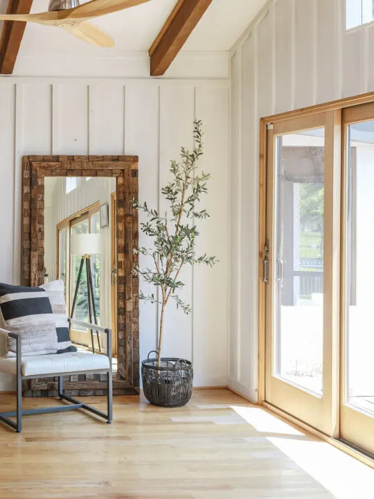
How To Choose An Off-White Paint Color
Paint colors can look one way in a store, or on a screen, but they often look a little bit different in your home. Every room has unique lighting, decor, and finishes that can influence how a paint color looks.
This is why it’s so important to test out paint colors in your home before deciding!
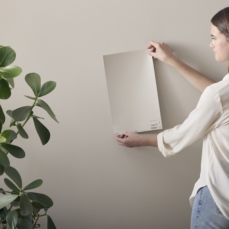
Wait!… I found a better way to test paint colors in your home
Samplize makes testing paint colors in your home easier than ever. Their Peel-and-Stick Vinyl Paint Samples use real paint, so you’ll see exactly what the paint color looks like.
I’ve personally been using and recommending Samplize for years now – they are one of my favorite brand partners!
Sale alert! Right now you can 2 samples for FREE, when you purchase 8 or more. And yes, you can stack this with the bundle deal going on!
OK, let’s get back to the off-white paint colors.
Ballet White (OC-9) by Benjamin Moore
Ballet White – LRV: 71.97 (LRV, or Light Reflectance Value is a scale commonly used by design professionals where 0 = absolute black and 100 is pure white.)
Also known as Benjamin Moore – Muskoka Trail (974)
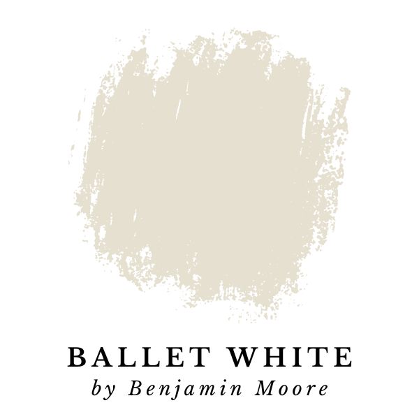
If you really want to lean into the off-white category and find a paint color that’s definitively not pure white, then Ballet White by Benjamin Moore might be the perfect color.
Ballet White has a LRV of 71.97 making it the darkest color included in this paint color guide. It’s a hybrid color that blurs the line somewhere between off-white, beige, and greige.
It’s neutral and gets a rich creamy appearance from its golden yellow undertones.
“A crowd-pleasing off white that offers just the right amount of color.”
Benjamin Moore
In the image below, this kitchen is painted with Ballet White walls, and Swiss Coffee cabinets. There is a sharp contrast between the two colors.
Swiss Coffee appears very white, and makes Ballet White look darker and more creamy by comparison.
What’s interesting about this, is that Swiss Coffee is actually also an off-white, and has more depth than most other white paint colors (LRV 81.91).
Eider White (SW 7014) by Sherwin-Williams
Eider White – LRV: 73 (LRV, or Light Reflectance Value is a scale commonly used by design professionals where 0 = absolute black and 100 is pure white.)
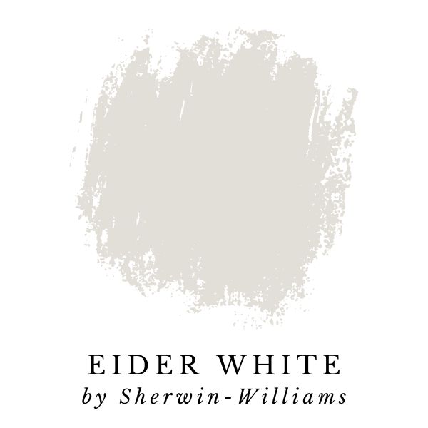
When you look at Eider White by Sherwin-Williams, the first thing that jumps out at you is that it has a prominently silvery gray appearance.
Eider White is quite cool for an off-white, but it’s still a neutral because of its gray base. This means that it should not appear aggressively cool, even in a North facing room.
This is another color that’s towards darker edge of the category with a LRV of only 73, making it close to crossover territory. It could be classified as a dark off-white, or a light gray.
Eider White is a Sherwin-Williams Top 50 color, which means that it’s very popular! Want to see more ultra-popular paint colors? Check out my articles: Sherwin-Williams Top-10 Most Popular Paint Colors, or look at Benjamin Moore Top-10 Most Popular Paint Colors.
“Create a bright, relaxing tone with this cool white paint and its gray undertone. So versatile you can use it in any room.”
Sherwin-Williams
Dove Wing (OC-18) by Benjamin Moore
Dove Wing – LRV: 77.52 (LRV, or Light Reflectance Value is a scale commonly used by design professionals where 0 = absolute black and 100 is pure white.)
Also known as Benjamin Moore: 960
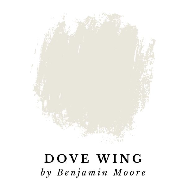
Dove Wing by Benjamin Moore is a beautifully creamy off-white paint color. It has a LRV of 77.52 which is light enough to create a light and airy vibe, but it has enough depth of color to make it a true off-white that appears rich and complex.
The color is made up of white base, with gray and golden yellow added to give it an appearance that, to my eye, is somewhere between creamy and silvery.
“Silvery undertones bring a luminous quality to this white.”
Benjamin Moore
In the image below, most of the room is flooded with tons of natural light, and Eider White gets slightly washed out, and appears as a true off-white. However, if you look above the windows where it’s a little more shaded, there is a strong contrast between the walls, and the true white ceiling. In the shadows, this color looks a lot more gray. I think this color was a perfect choice!
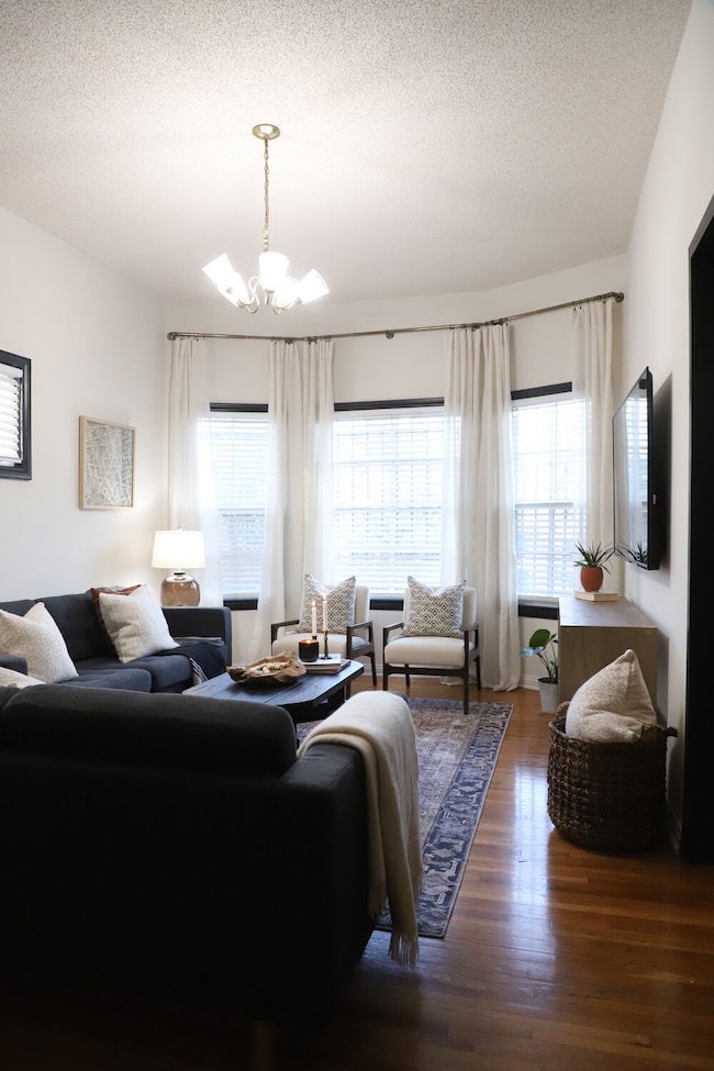
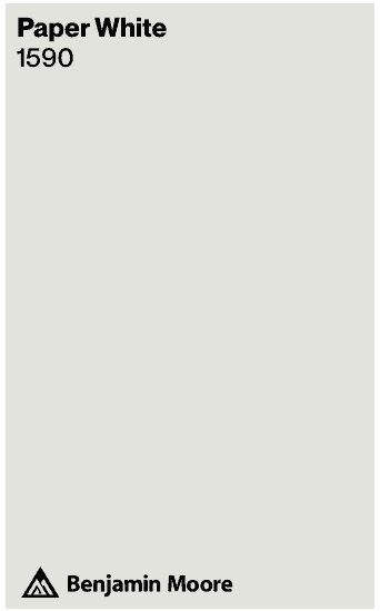
Paper White (OC-55) by Benjamin Moore
Paper White – LRV: 74.41 (LRV, or Light Reflectance Value is a scale commonly used by design professionals where 0 = absolute black and 100 is pure white.)
Also known as Benjamin Moore: 1590
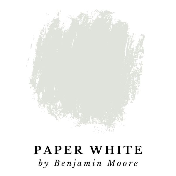
Paper White by Benjamin Moore is an off-white paint color with a less common color profile. It has a a light gray appearance with green undertones.
The combination of gray and green can actually give paint colors chameleon like undertones. From a technical standpoint, there is green dye in the paint, but in the real world, it can sometimes look blueish.
In a room with cool Northern light and a blue accent colors, Paper White will most likely end up looking grayish blue. But in a room with green decor, and some green plants, Paper White will look grayish green.
“Like a fresh sheet of paper, a touch of blue-gray lends a clean, crisp feel to this appealing white.”
Benjamin Moore
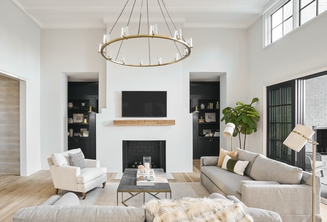
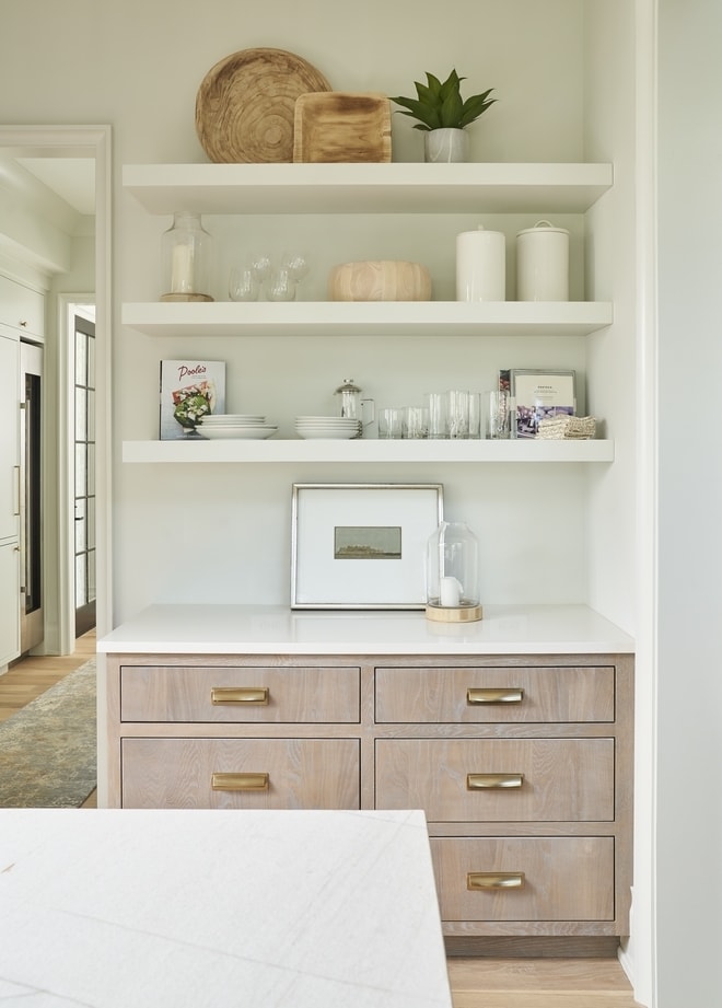
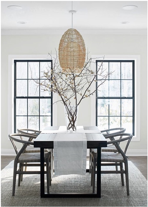
White Duck (SW 7010) by Sherwin-Williams
White Duck – LRV: 74 (LRV, or Light Reflectance Value is a scale commonly used by design professionals where 0 = absolute black and 100 is pure white.)
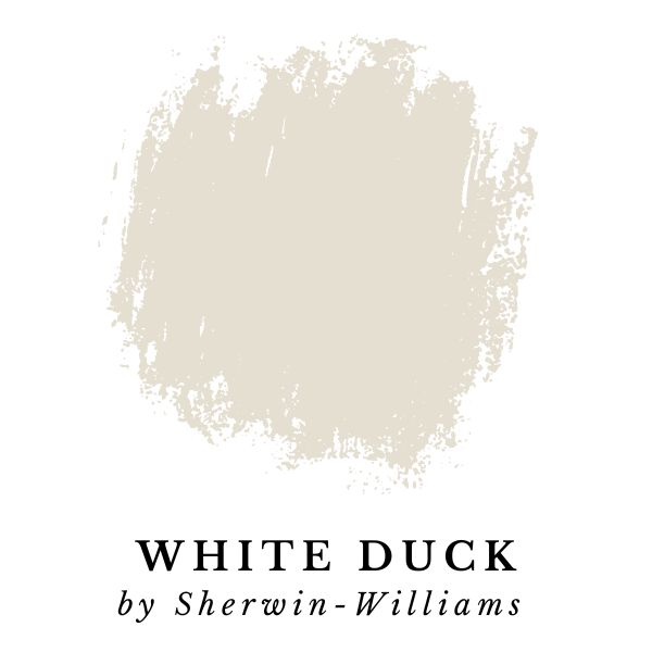
White Duck by Sherwin-Williams is a light off-white paint color that draws inspiration from beige and greige. It’s a warm neutral that looks a little bit creamy, and very appealing!
Like many paint colors, White Duck can look different depending on the lighting conditions in a room. With warm light, White Duck will look more creamy. However, in cooler light, it will look more greige.
White Duck is one of my favorite neutrals because it is extremely versatile! There is something special about it that makes it look good no matter what. It’s commonly used as an exterior paint color, but looks just as good inside.
“This cool white is creamy and bright. A favorite for classic exteriors and accents throughout the home.”
Sherwin-Williams
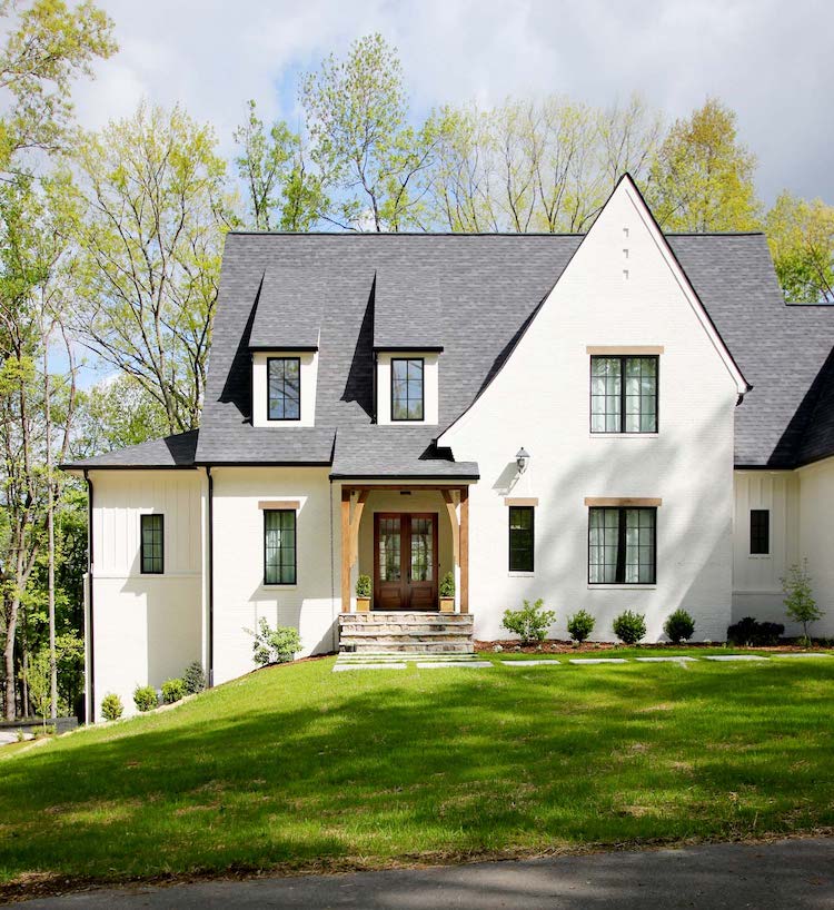
Seapearl (OC-19) by Benjamin Moore
Seapearl – LRV: 76.43 (LRV, or Light Reflectance Value is a scale commonly used by design professionals where 0 = absolute black and 100 is pure white.)
Also known as Benjamin Moore – China White (OC-141, PM-20) & Seapearl (961)
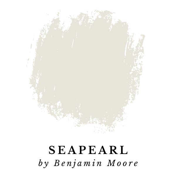
Seapearl by Benjamin Moore is an amazing neutral off-white paint color. Its color profile is similar to an extremely light greige. Greige is inherently warm, however Seapearl has cool undertones that offset the warmth.
This paint color is identical to Benjamin Moore’s China White (OC-141 or PM-20).
Seapearl is made from a mix of warm and cool tones make this paint color pair nicely with many other paint colors. Depending on the lighting, and the other colors in a room, Seapearl can have a tendency to show a little bit of a green undertone.
Cool gray undertones freshen up this shade of white.
Benjamin Moore
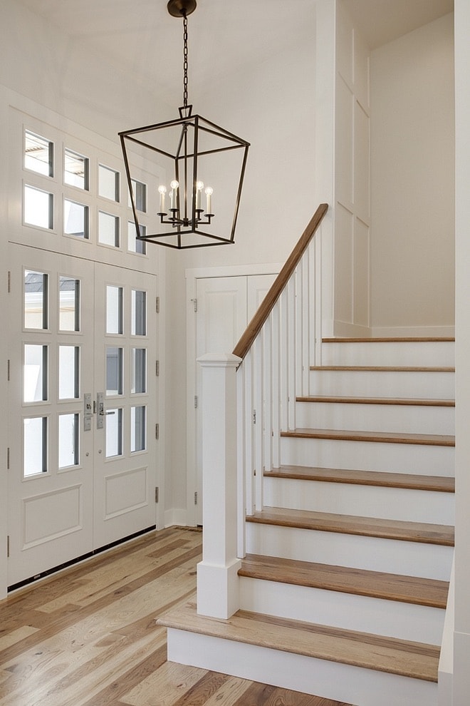
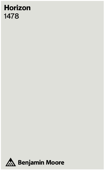
Horizon (OC-53) by Benjamin Moore
Horizon – LRV: 72.82 (LRV, or Light Reflectance Value is a scale commonly used by design professionals where 0 = absolute black and 100 is pure white.)
Also known as Benjamin Moore – 1478
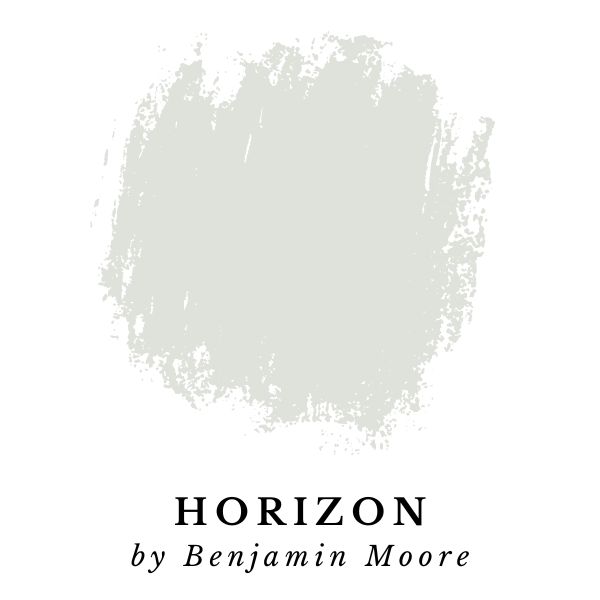
Horizon by Benjamin Moore is on the darker side for off-white paint colors. It has a LRV of only 72.82 making it the second darkest paint color in this guide.
This color is similar to Paper White by Benjamin Moore, which we looked at a few colors back. It’s made up of the same gray-green base, which can end up looking either greenish, or bluish.
Horizon is a darker shade than Paper White. If you’re considering these colors, I would recommend getting samples of both to see which one looks better in your home. It maybe be difficult to compare the two on a screen because they are quite similar.
You can click on the images below to order a Peel-and-Stick sample from Samplize.
“With its subtle blue undertones, this pale, effortless gray provides a fresh slate in any room.”
Benjamin Moore
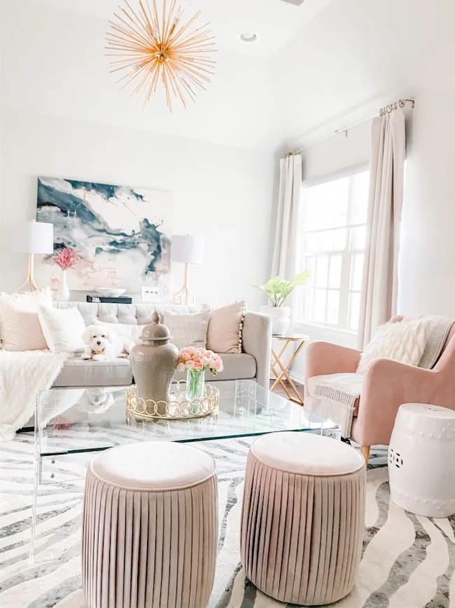
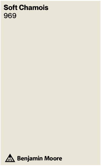
Soft Chamois (OC-13) by Benjamin Moore
Soft Chamois – LRV: 77.4 (LRV, or Light Reflectance Value is a scale commonly used by design professionals where 0 = absolute black and 100 is pure white.)
Also known as Benjamin Moore – 969
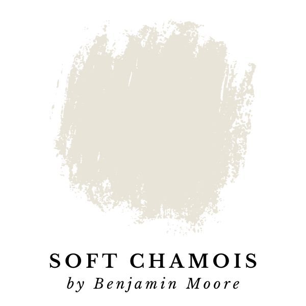
Soft Chamois by Benjamin Moore is a light, bright off-white paint color. It’s warm, creamy, and perfect for almost any room.
This paint color should be a top contender if you’re looking something that has slightly more depth than a true white, but you need a neutral with minimal undertones.
Soft Chamois is far from dull and boring, but it does create the perfect backdrop for other colors in your home to shine as center of attention.
“A soothing white with a warm, delicately shaded cast.”
Benjamin Moore
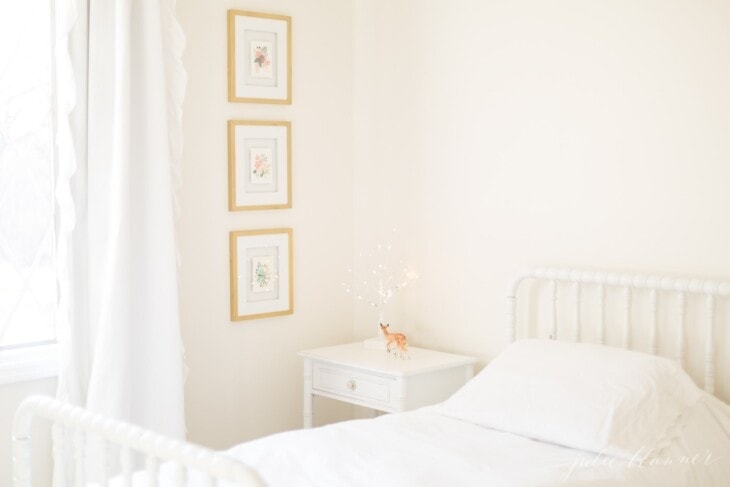
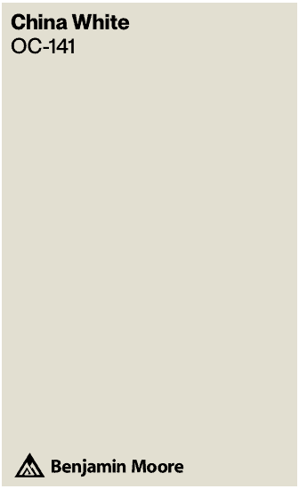
China White (OC-141) by Benjamin Moore
China White – LRV: 76.43 (LRV, or Light Reflectance Value is a scale commonly used by design professionals where 0 = absolute black and 100 is pure white.)
Also known as Benjamin Moore – Seapearl (OC-19, 961) & China White (PM-20)
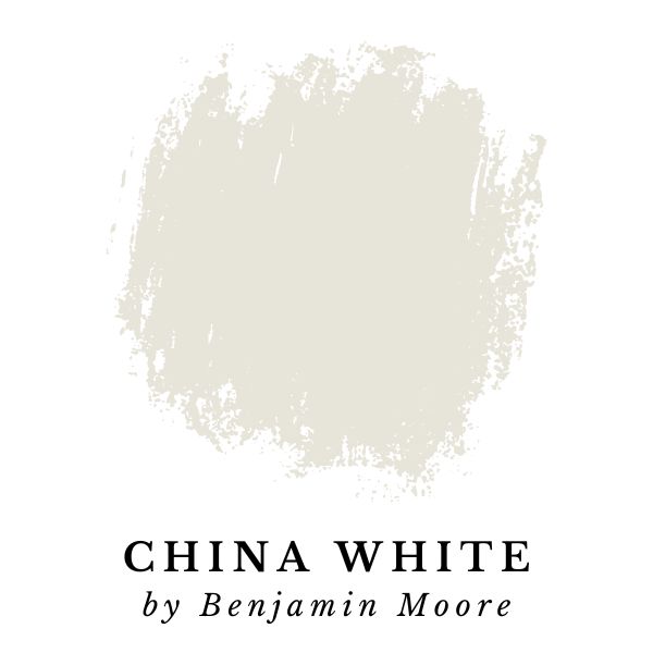
China White by Benjamin Moore is a bright off-white with minimal undertones. It’s very similar to the previous color.
Just like Soft Chamois, this color is versatile, and it’s usually a good fit in nearly any room. The neutral creamy tone just seems to work well with so many color palettes.
Although it may be difficult to spot the exact differences between the two colors on a screen, Soft Chamois is slightly brighter (LRV of 77.4 vs 76.43), while China White is the cooler of the two colors.
Click on the images below to see them over on Samplize.
“Cool gray undertones freshen up this shade of white.”
Benjamin Moore
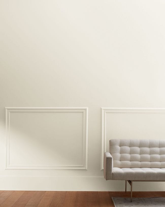
OK, there you have it! These have been my top picks for best off-white paint colors. I hope this article was helpful and you were able to find some great colors!
Want my exact strategy on how to design a room that’s cohesive?
My Top Painting Tips & Resources:
The easiest way to see paint samples on YOUR walls:
Before you make a final decision on a paint color, test out your favorites with Peel-and-Stick paint samples from Samplize! The 9” x 14.75” Peel-and-Stick samples use real paint, and make it easy see how a color will look in your home (without the mess).
Plus, it saves you the trouble of having to pick up multiple tiny cans of paint that end up going to waste.
Check out my full Samplize Review where I share about my experience using Samplize to help me decide on a paint color.
Samplize allows you to see paint colors options in a variety of locations. The peel-and-stick squares have non-damaging adhesive that you can reposition many times, and can even wrap around corners to show contrast between walls.
Testing out a paint color in your home is important because a paint color’s appearance depends on the unique lighting conditions in your home.
A paint color can even look a little different throughout the day as lighting conditions shift with the sun’s position in the sky.
Make sure to examine your paint sample during different times of the day to see how natural light affects the appearance of the color.
Tip: Don’t forget to see how the paint colors look with the lights on (and off!) in the room you’ll be painting.
Choose a Paint Color Step-by-Step Guide
Want to know exactly how to pick the best paint colors for your space? How do you know which color of white is the best fit for your home, your decor, the lighting in your home, and your style?
I wrote an entire blog post with easy to follow steps for choosing a paint color that answers all these questions, and more.
Check it out here: How To Choose the PERFECT Paint Color Using Undertones, Lighting, & Sheen
It has all the info you need to know – from undertones, sheen, to the lighting in a room, and so much more.
How To Get A Great Deal On Paint
Did you know that you can use budget friendly paint, and have it color matched to premium Benjamin Moore or Sherwin Williams paint colors? At Joyfully Growing Blog, we always use Glidden Premium paint from The Home Depot. √
Glidden Premium rivals the quality of the top paint lines from Behr, Sherwin Williams, and Benjamin Moore.
Any paint store, or home improvement store with a paint section will be able to match colors from most major brands. This means that you can select one brand of paint, but get it mixed in any color you want!
In many cases, affordable paint like Glidden Premium can be up to 50% cheaper than the ‘big name brand’ competition. This can save you a ton of money!
Our Go-To Painting Supplies
- Paint brushes – I recommend ‘Pro Grade’ paint brushes, they’re the perfect budget-friendly option. This set comes with both flat and angled brushes to get every nook and cranny. I LOVE the quality and, in my experience, they’re much more affordable from Amazon compared to in-store prices.
- Paint rollers – Cover more surface area with a handy roller.
- Paint sprayer – Paint brushes and paint rollers will get the job done, but for serious efficiency and productivity, you cannot beat this Graco Magnum Project Plus airless paint sprayer. I personally own this paint sprayer and have used it on tons of painting projects.
It’s an excellent quality sprayer, and powers through any painting projects in a hurry. Painting with an airless sprayer makes it easy to complete projects in much less time.
- Drop cloth – Skip the mess and grab a reusable drop cloth instead. This will come in handy for future projects. Just pop it in the washing machine after you’re done painting and it will be ready to go for the next project.
- Multi-surface painter’s tape – I always use this brand of painter’s tape, it’s great for smooth or lightly textured walls, trim, baseboards, tile, or even glass. It sticks quick and is easy to remove.
- Sanding sponges – For smoothing and prepping surfaces, you’ll need a couple of sanding sponges in different grits.
Looking for more paint color guides?
If you’re looking for white paint colors that are a little bit brighter than these off-whites, check out my White Paint Color Guide.
Or, check out my Gray Paint Color Guide. In the post I’ve broken it down into four categories: Neutral Gray, Warm Gray, Cool Gray, and Dark Gray.
My Other Paint Color Resources
Helping people choose great paint colors is one of my passions! I’ve written tons of articles to help streamline and destress your decision-making process.
Thanks for reading along! If you have any questions, please ask in the comments below!
